Construction websites are a huge part of a construction business. Other construction companies, builders, architects and design professionals all use the internet to find each other and communicate with one another. Construction websites have become an integral marketing strategy tool for construction companies that want to grow their business or show off their work. Web designers will often create unique designs for these construction companies in order to stand out from the competition while generating leads and showcasing their client’s projects in an appealing way. Here are 40 websites of construction companies you should be visiting right now!
1. Connect Homes
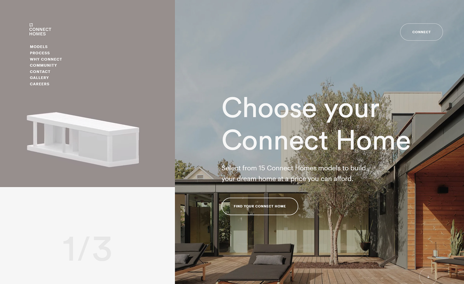
Why it works: Interactive and engaging web design with great intro animation. The high quality images used in this construction website look professional and visually appealing while the website’s use of different font weights are also well thought of.
connect-homes.com
2. Mike Schaap Builders
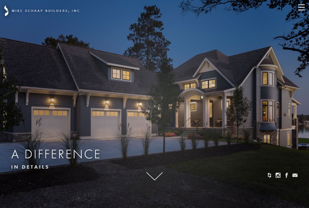
Why it works: The hero slider of this construction company is simple yet elegant and pleasing. Mike Schaap Builder’s website design may be simple, but the negative spaces have been well utilized and information is easy to digest.
mikeschaapbuilders.com
3. Luxury Simplified
Why it works: The hero section of the website displays an exciting video background, while the services section has unique and beautiful pictures. Important contact information of this construction company is clearly presented with easy navigation.

luxurysimplified.com
4. Ditto
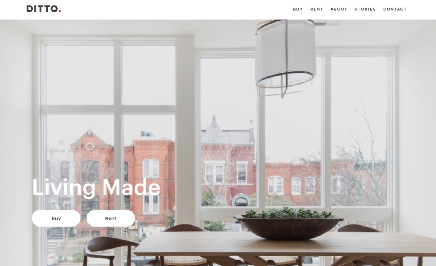
A construction website design that is simple, modern and stylish. The usage of Ditto’s high quality photography throughout their website is both pleasing and engaging. The website’s straightforward structure and navigation make information easy to access, resulting in a pleasant experience for website visitors.
dittodc.com
construction website design
5. Maman Corp.
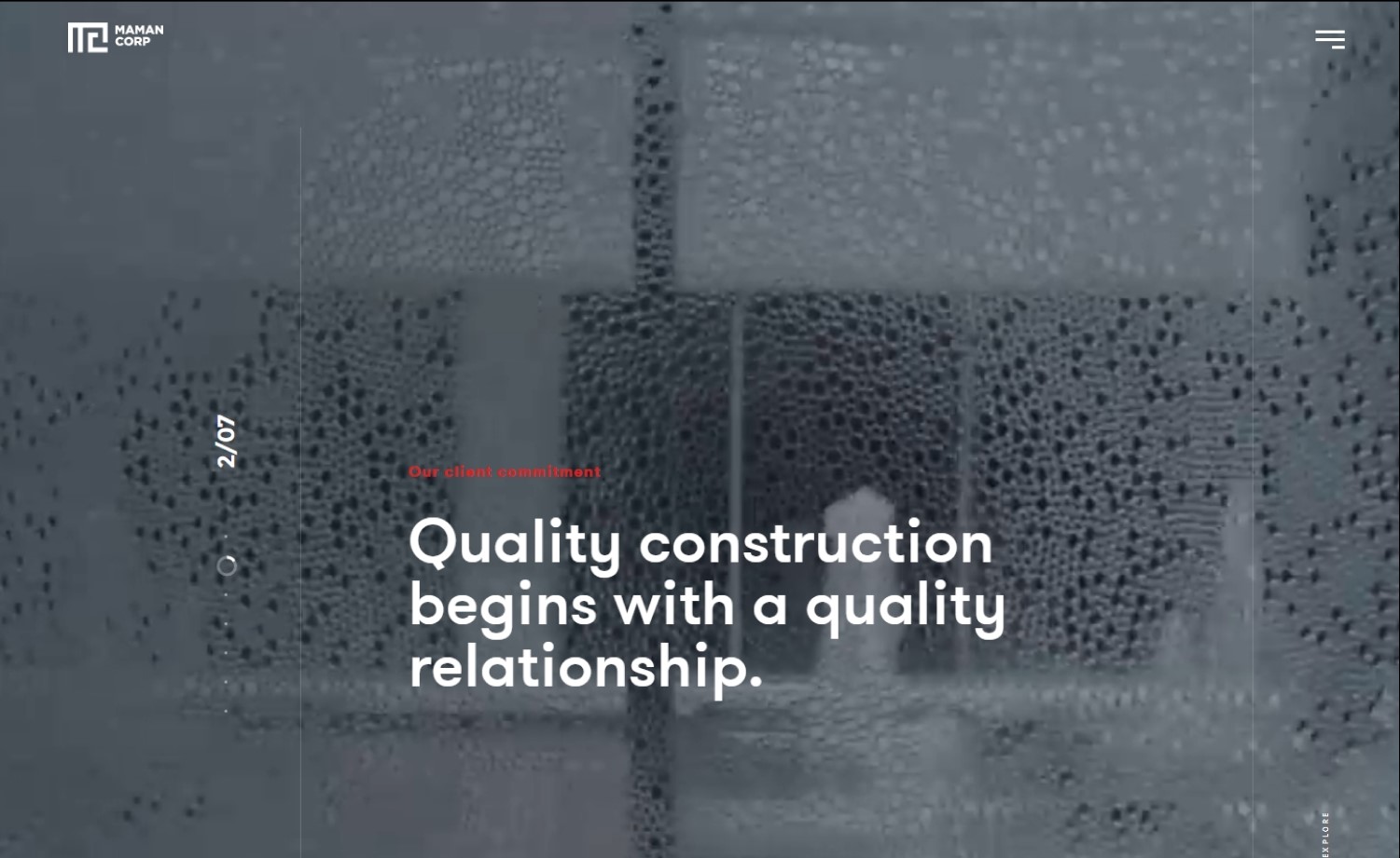
Why it works: Visiting the Maman’s Corp construction website is a wonderful experience. Everything about this site is fascinating; the videos and scroll-triggered transitions are very engaging. The website design, typeface, and color scheme are all well thought out.
maman-corp.com
6. Hutchinson Builders
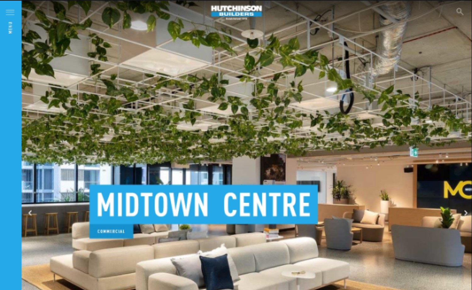
Why it works: A visually attractive construction website. The use of different sizes of high quality images and fonts as well as the use of their brand colors all throughout their website are all on point. Their firm’s contact information, services page, and projects page can all be found with ease.
hutchinsonbuilders.com.au
7. Bill Huey + Associates
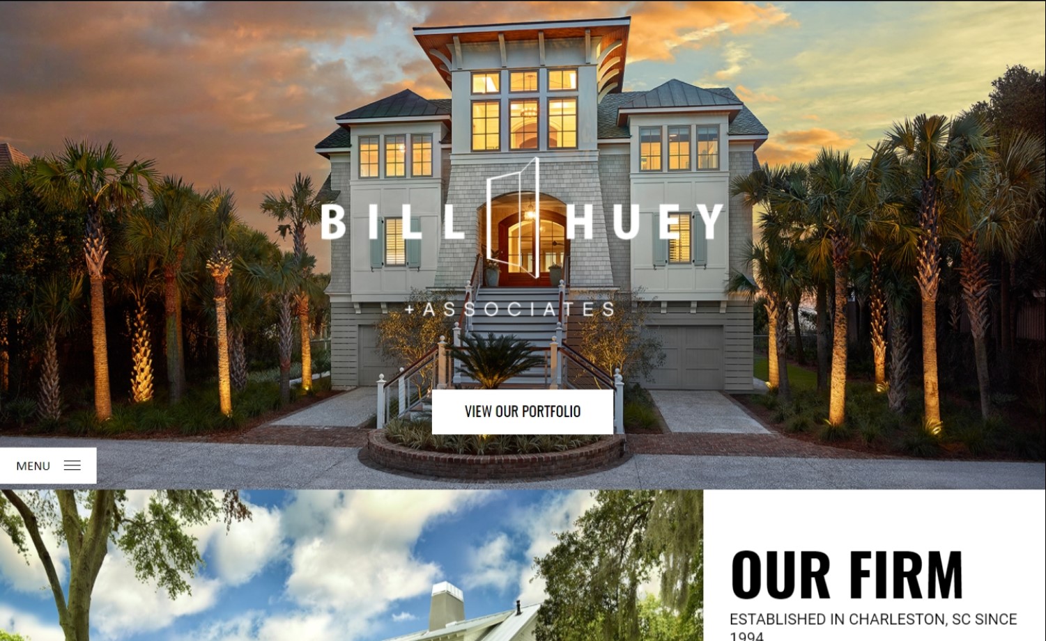
Why it works: The website design is well-structured, the colors are consistent, and the animations are subtle and inconspicuous. This commercial construction company also has fantastic visuals and high quality photography that are featured in well-thought-out branding.
hueyarchitect.com
8. Toll Brothers
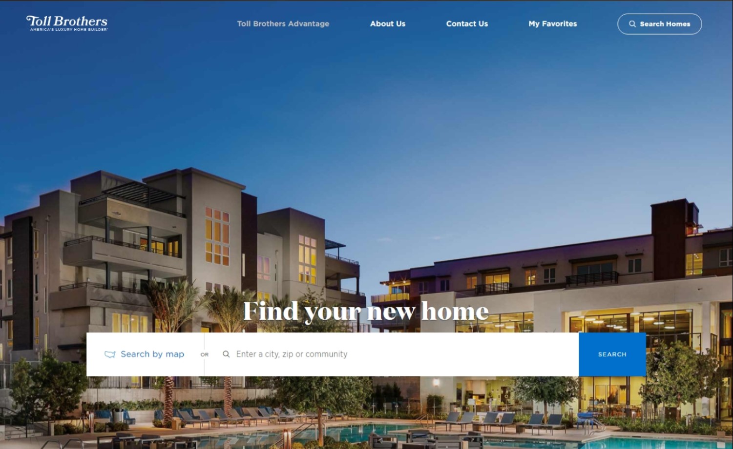
Why it works: The Toll Brothers’ website is elegant and sophisticated. The quality of the background images used in this construction web site is superb. The filter on the hero image adds contrast which makes overlayed text readable. The map they use to display their locations is user friendly.
tollbrothers.com
best construction websites
9. Re-Bath®
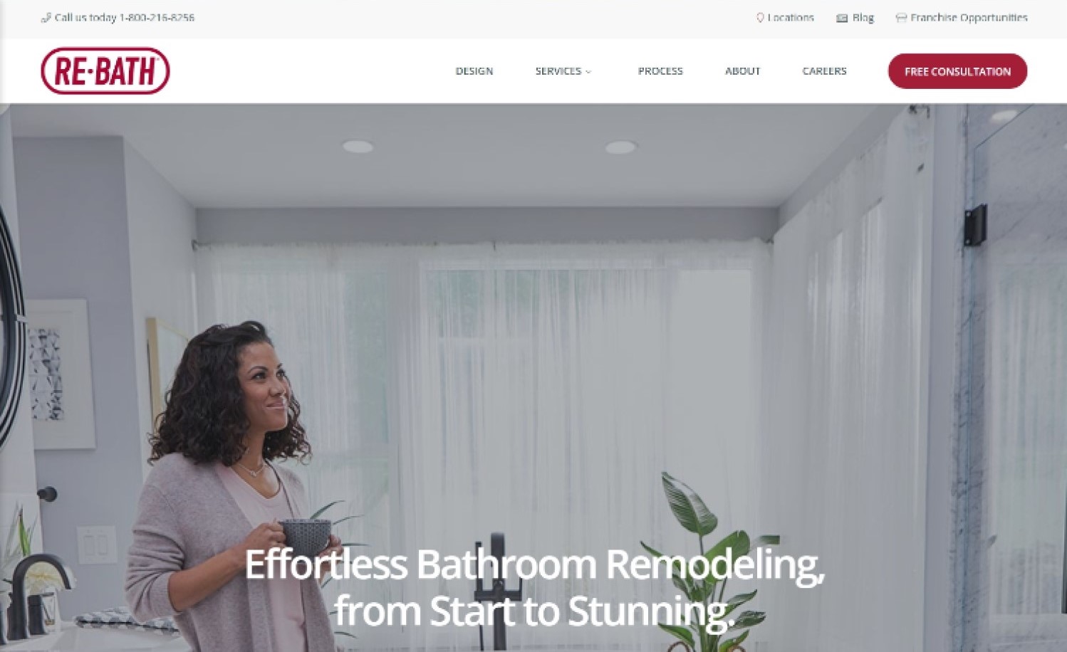
Why it works: The home page of this construction company features images of people smiling and subtle backdrop art depicting trust and friendliness. Despite the fact that there is a lot of text on the home page, good whitespace usage and section breaks make it appear attractive. The call to action button leading to the contact page is always visible.
rebath.com
10. Segale Bros.
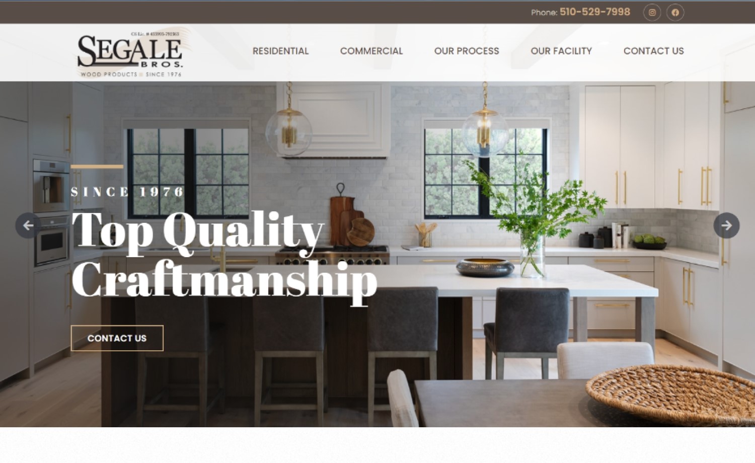
Why it works: This is an excellent construction website design example. The hue of the colors used are well-balanced and go nicely with the typefaces. On-scroll transitional effects add vitality to the home page. A sticky navigation bar with a comprehensive dropdown menu is also included on this site.
segalebros.com
11. GFI Partners
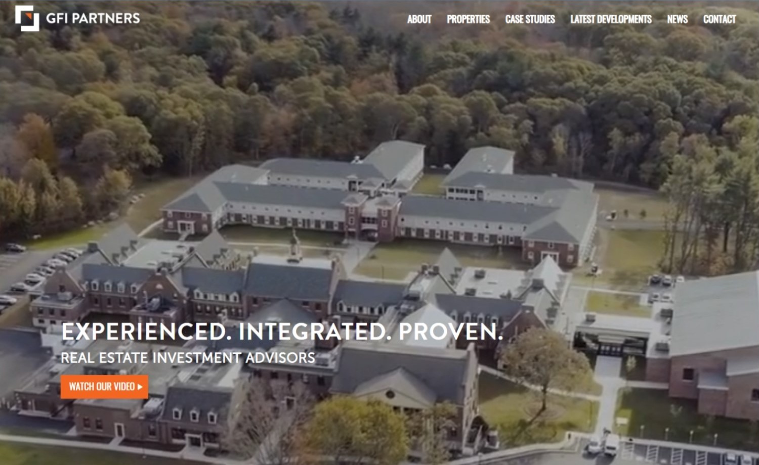
Why it works: This construction website’s full-screen hero background video offers a sneak peek of the firm’s skills and high quality work. The colors and locations of the clear call-to-action buttons and sections are what make them so striking and noticeable. Take note of how specific sections in the home page include links to all other pages on the site.
gfipartners.com
12. Brymor Group
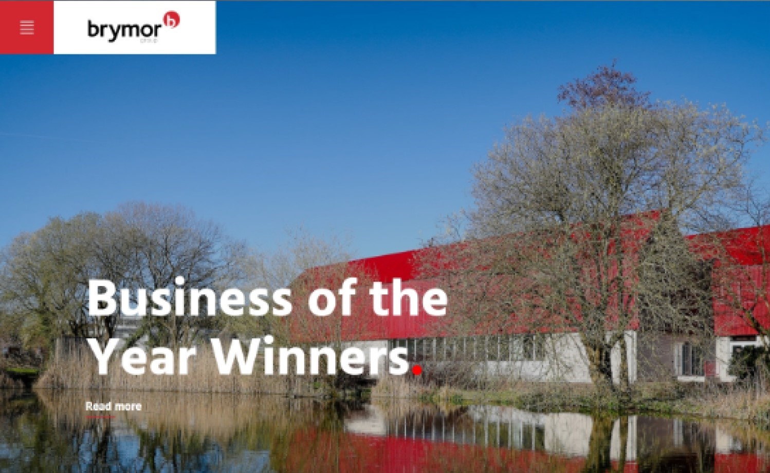
Why it works: This web design is a visual delight characterized by large fonts, images, and page sections. The beautiful spacing, quality images, and high contrast text sections make this construction industry website professional and clean. Plus points for the visually timed hero image slider.
brymor.co.uk
construction website examples
13. ADC Engineering
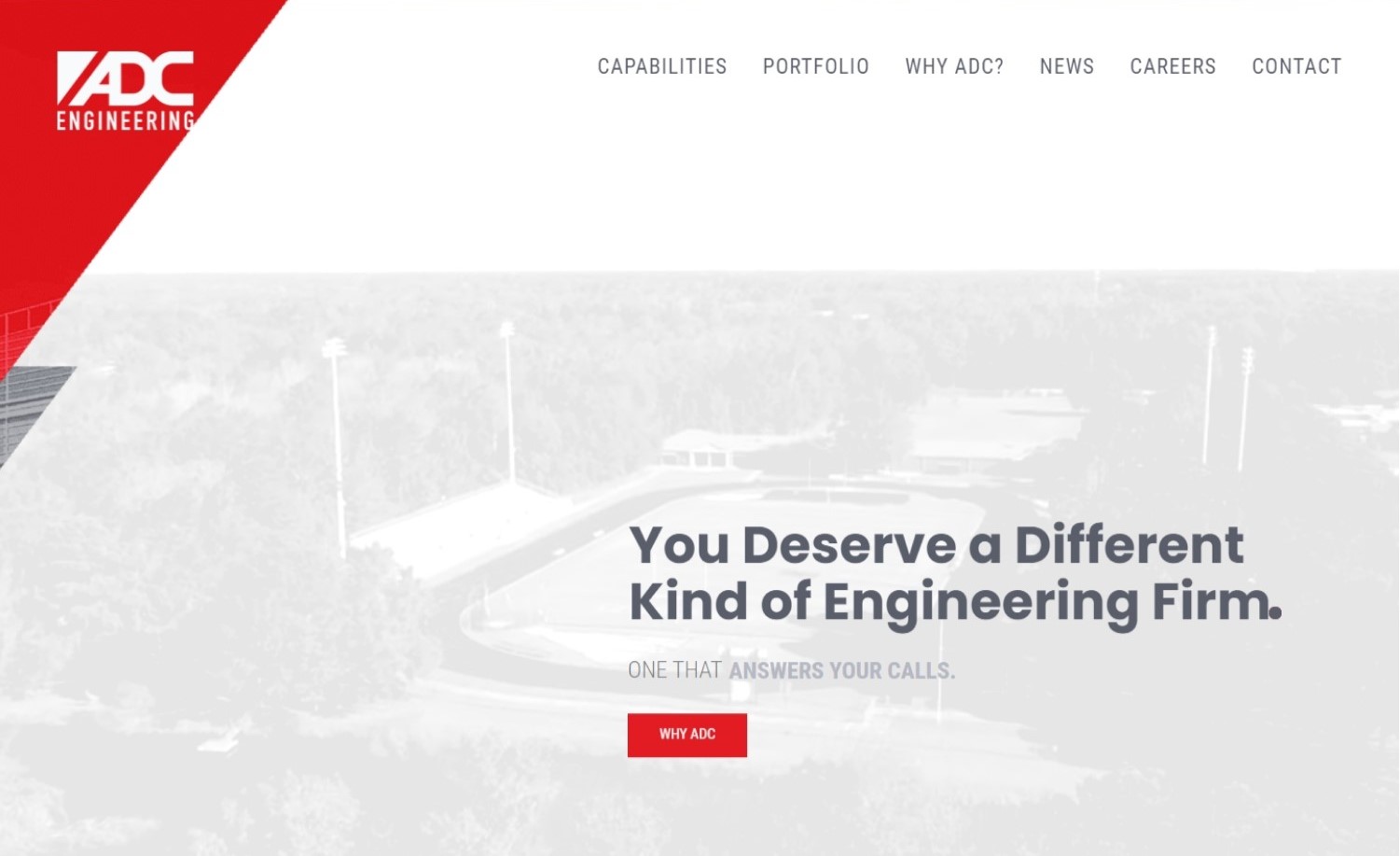
Why it works: The animation on the hero section, when the home page opens, adds flair and brings focus to the company’s statement of purpose. The striking red color gives a feeling of excitement and vigor. The containers in amazing shapes and sections add interest.
adcengineering.com
14. Scape Construct
Why it works: This web design features brief, concise, and clean text sections. The page sections are well-thought-out as if one was reading a story. Other notable design features include solid alignment, sharp and stylish fonts, subtle hover effects, contact form over a dark parallax image.
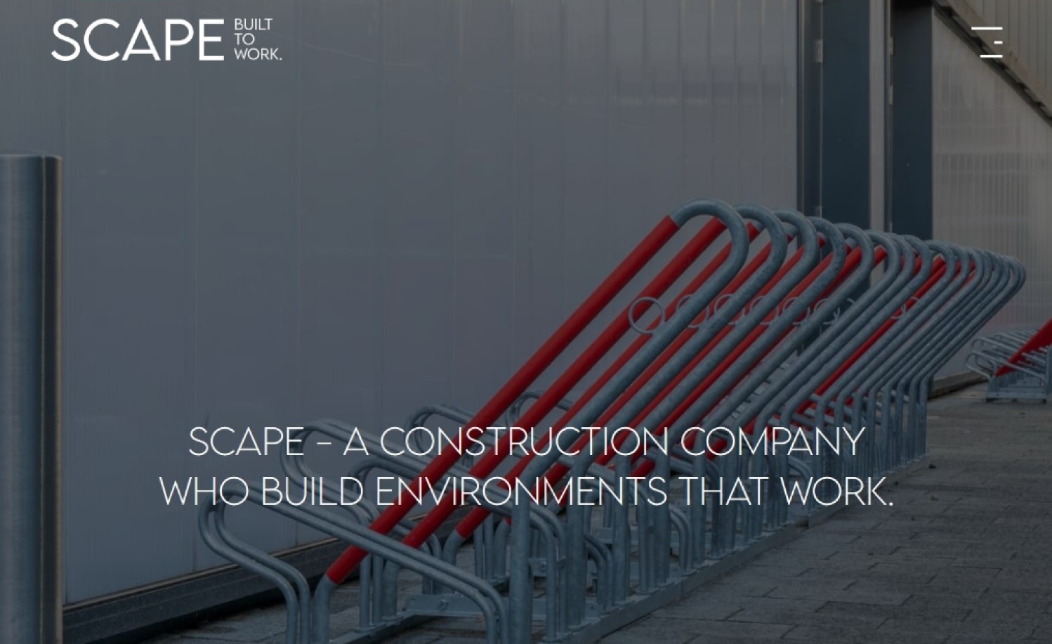
scapeconstruct.com
15. Cover
Why it works: This great website is informative and is well suited for the unique products offered by the construction company. This site also features professional photos of their actual products and features. The virtual tour function is a good way of further showcasing their product.
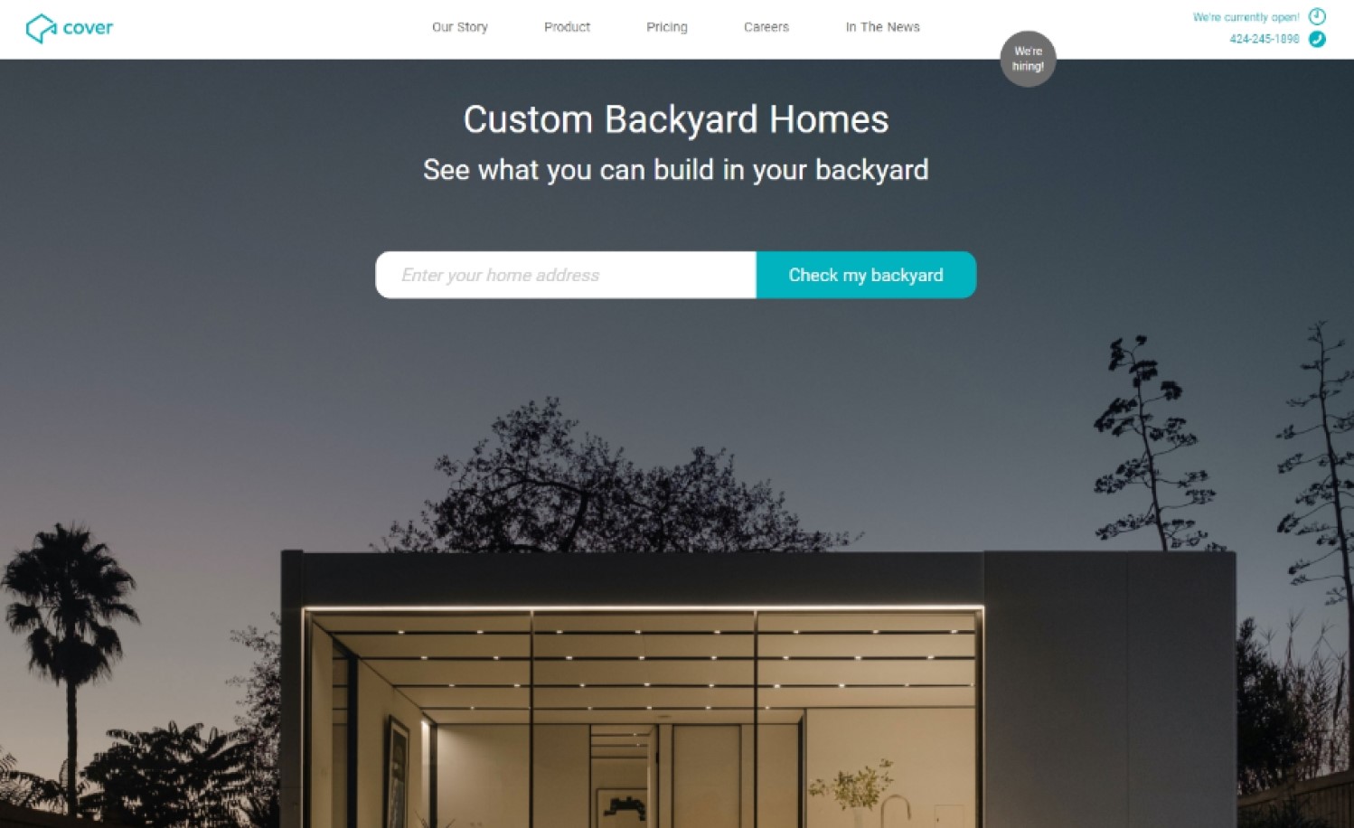
buildcover.com
16. Schumacher Homes
Why it works: Despite the fact that it has a small homepage, this construction company website is stylish and to-the-point. The custom logo font adds a little bit of class. A very in-depth dropdown feature with pictures, descriptions, and links to internal pages is also included on the site.
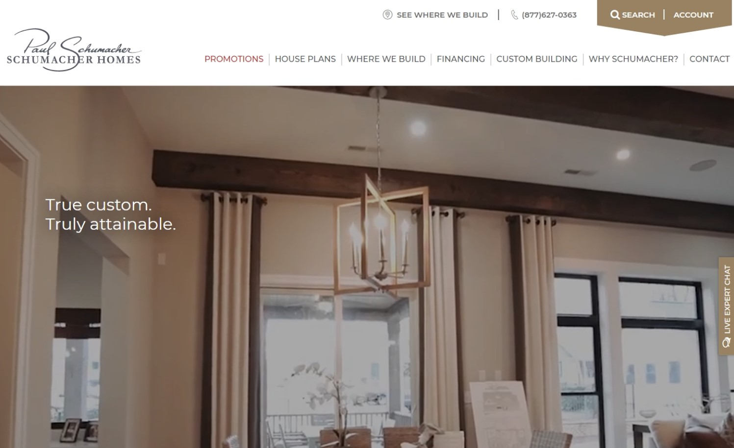
schumacherhomes.com
construction websites design
17. Canyon Design Build
Why it works: Nothing makes a global construction company website more sincere and honest than using images of the company’s actual people and work. The alternating image and text sections and unorthodox alignment make this site unique. This style is also present on the projects page and service pages.
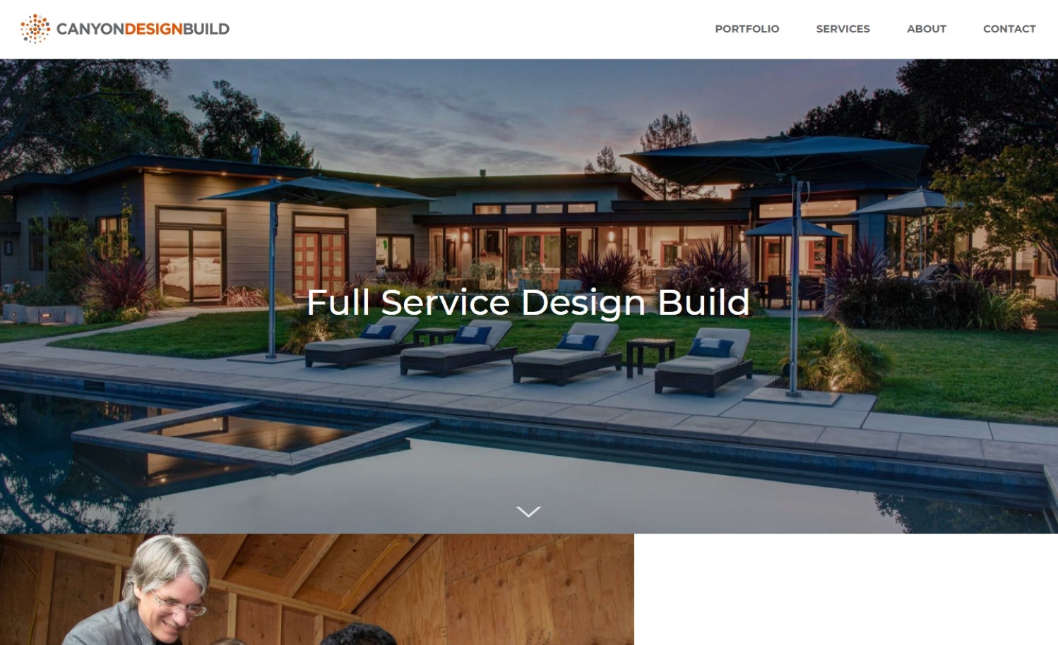
canyondesignbuild.com
18. Level 10 Construction
Why it works: Featured in this construction company website are creative and unique page sections. The home page has large images, unusual text placements, overlapping sections, and mixed alignments. The hero section is dynamic with a blend of background video and zooming images.
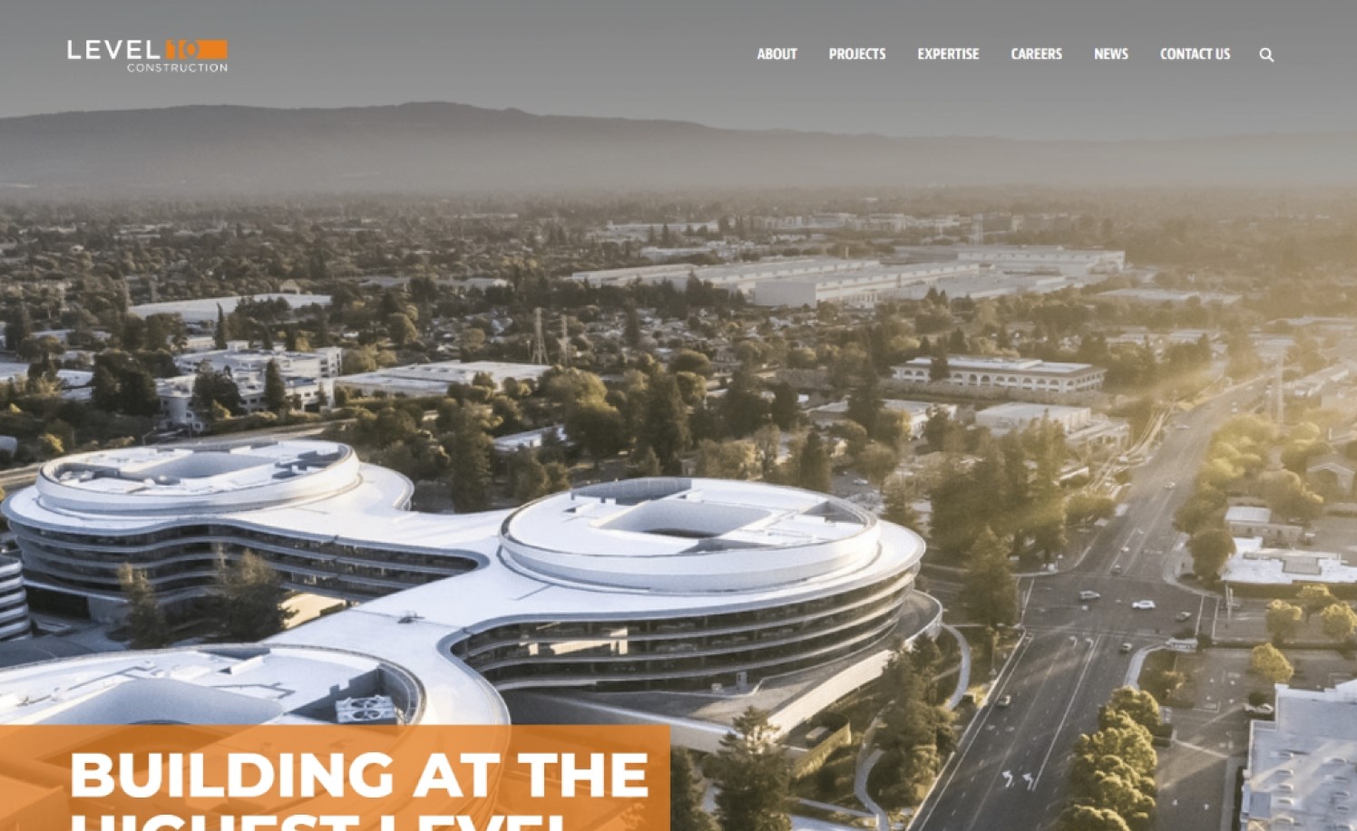
level10gc.com
19. PCL Construction
Why it works: Because of the animations and additional graphical design features, many of the sections on the web design are extremely creative and attention-catching. The use of big heading fonts and clear background images helps to make this construction services site appear modern and current.
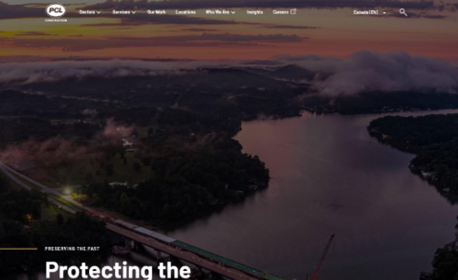
www.pcl.com
20. Reborn Home Solutions
Why it works: Despite the site looking too busy, the creative and unique page sections and the subtle transition animations used make this a good construction website. Social proof is visible via customer testimonials and ratings from different rating platforms. The call to action is always visible.
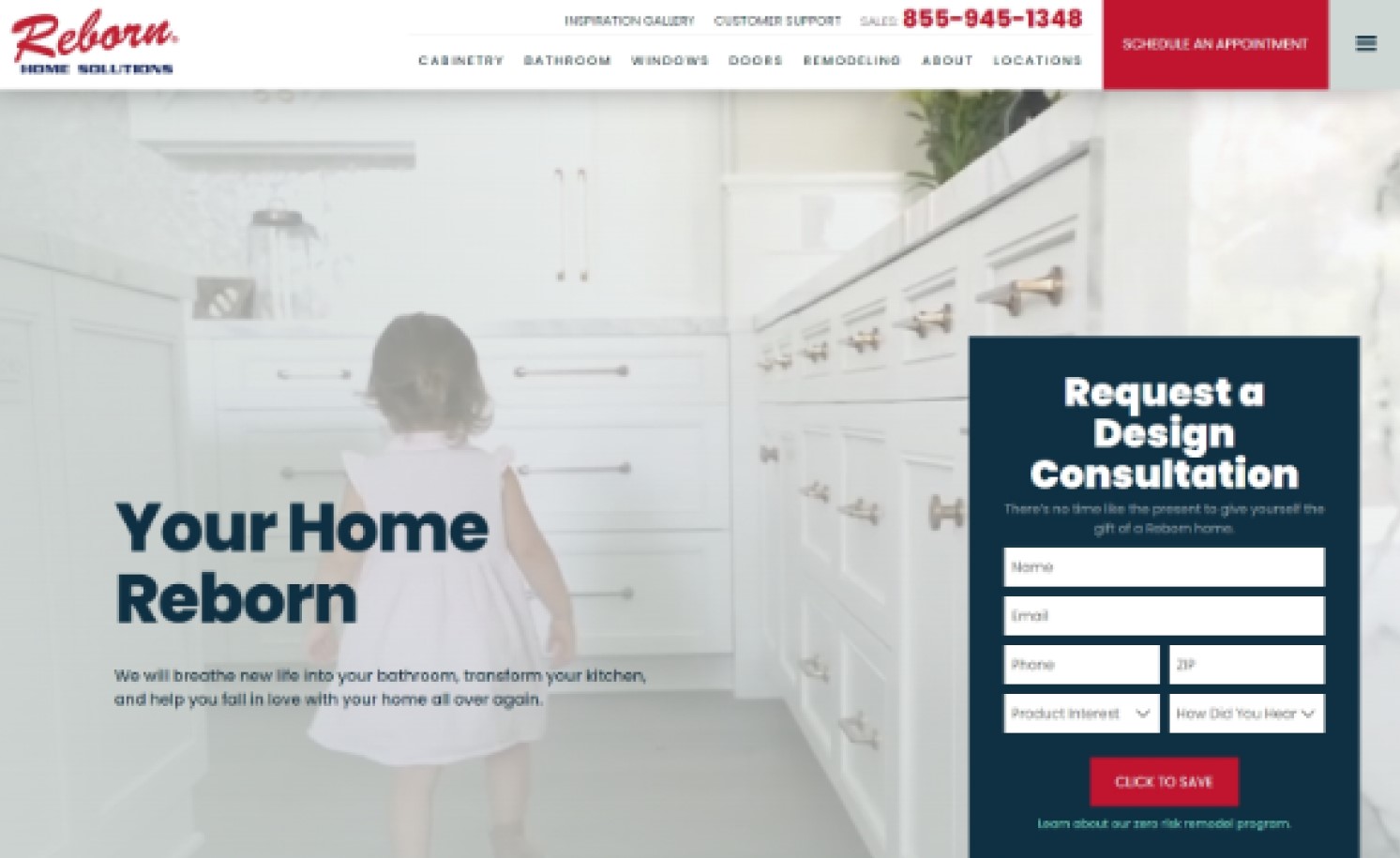
reborncabinets.com
Beautiful Construction Websites
21. Farrell Building Company
Why it works: This great website is easy to navigate because of the well-thought-out links and page navigation options. The pages are uncluttered and elegant. The subtle movement and on-hover effects are not distracting. Whitespace is effectively utilized, which helps to keep the site tidy.
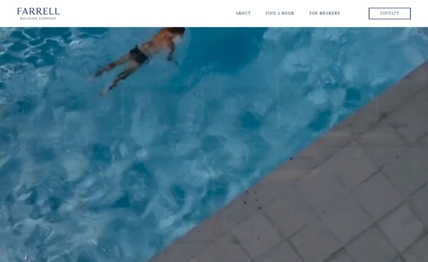
farrellbuilding.com
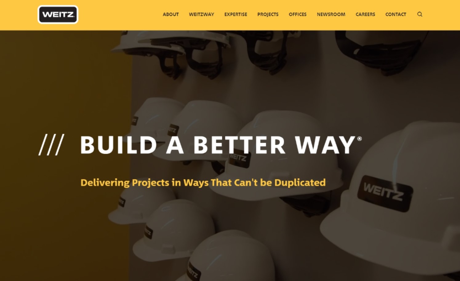
22. Weitz Commercial & Industrial General Contracting
Why it works: The colors on this website (black and yellow) are ideal for businesses in the construction industry. The break provided by the alternating dark and light sections within the page helps to organize well-written information. Overall, there is excellent spacing among the components.
weitz.com
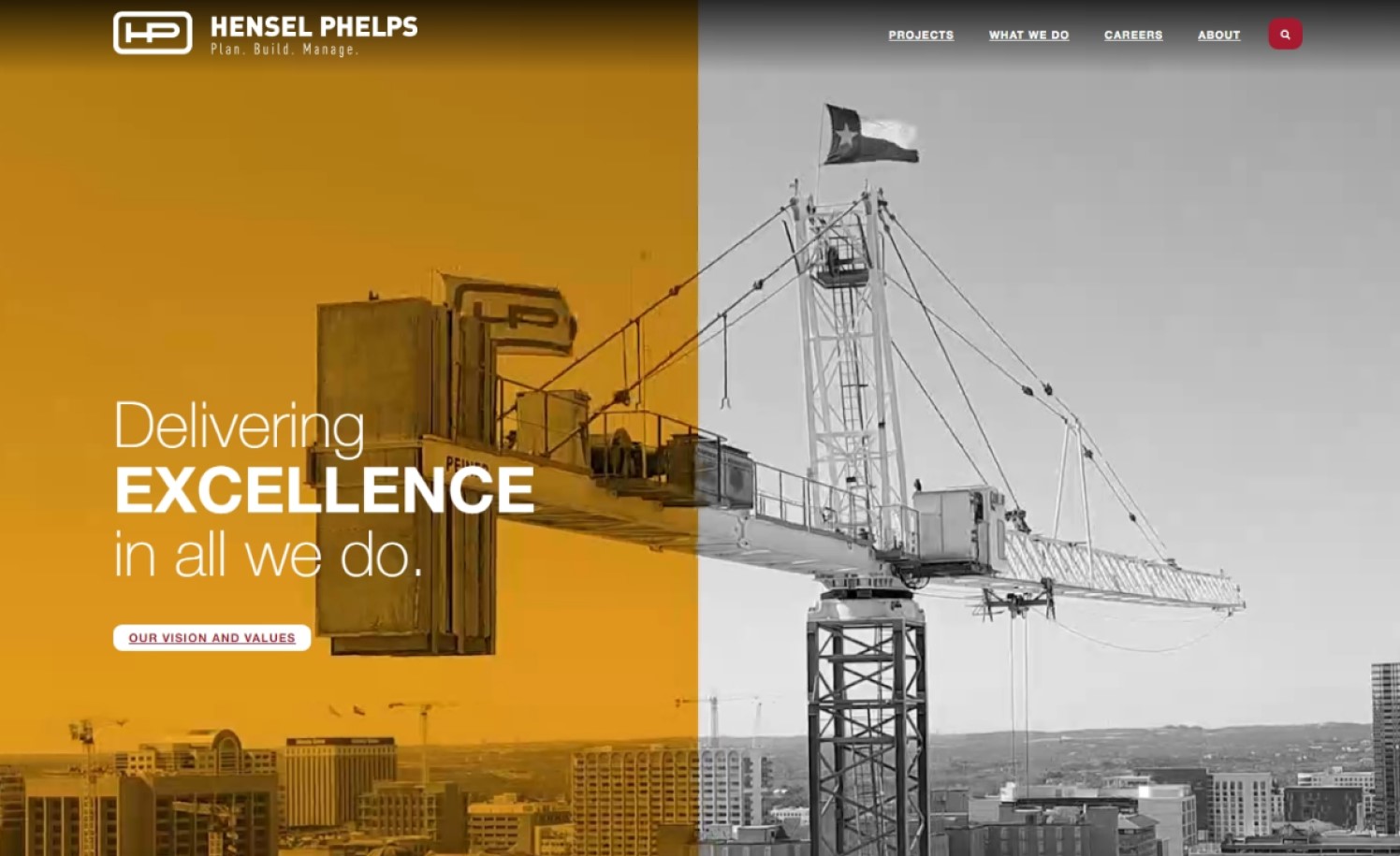
23. Hensel Phelps
Why it works: Hensel Phelps focused on their individual project pages on their website. Previous projects are highlighted in their case studies and portfolio page. Design-wise, this construction website is full of high quality photos of their past projects, their crew, and their equipment.
henselphelps.com
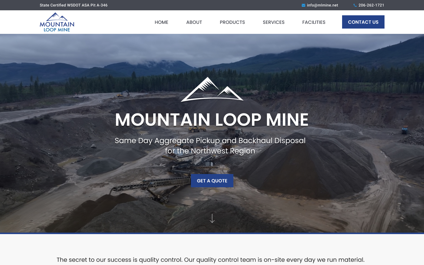
24. Mountain Loop Mine
Why it works: The Mountain Loop Mine’s website is well-structured and professional, fitting for a company in the construction industry. The full-screen hero section serves to display their people and their work. Minimal design graphics are used. The web designer focused on information and organized content.
mlmine.net
best construction company websites
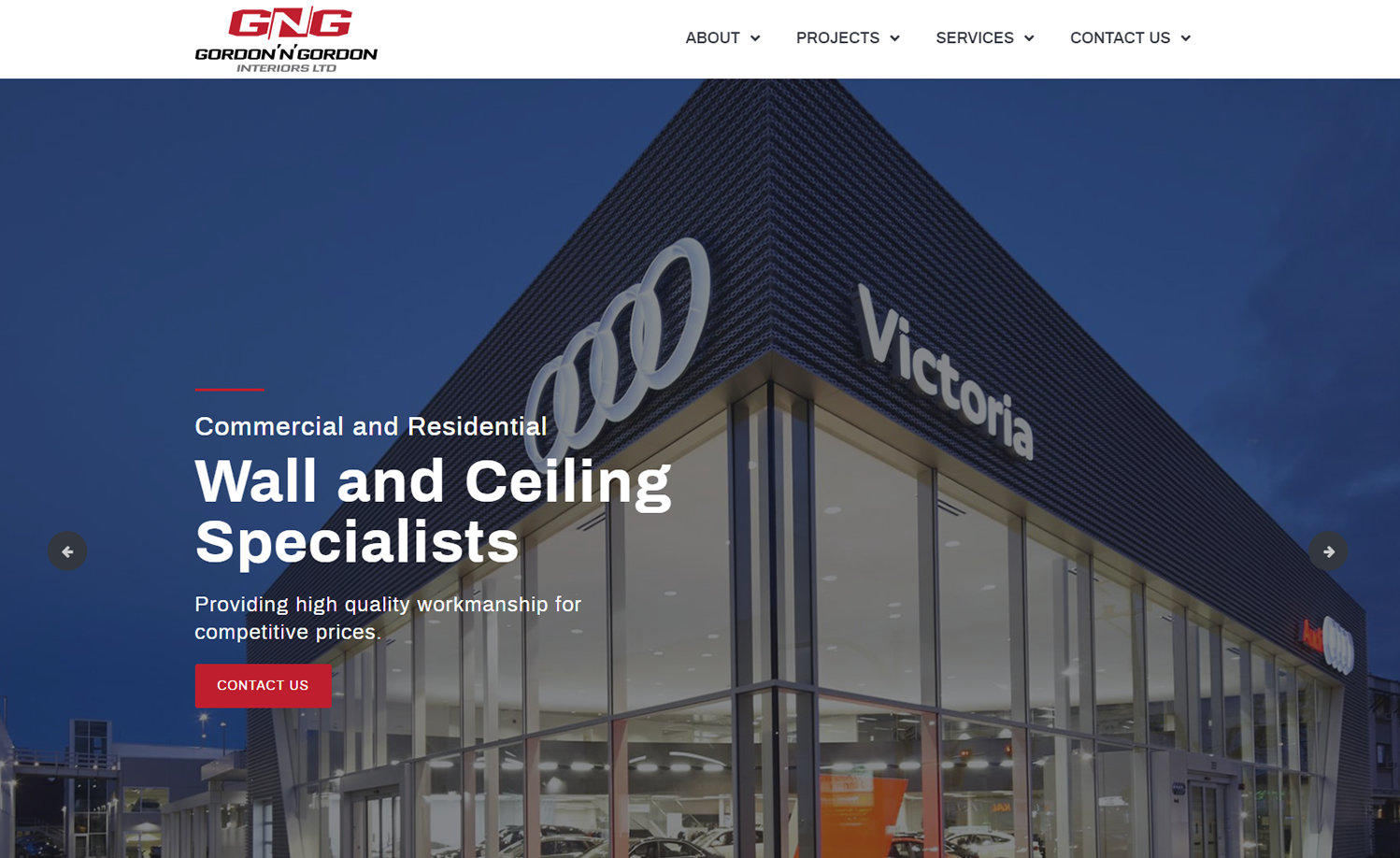
25. Gordon ‘N’ Gordon Interiors
Why it works: Overall, the website is spacious in appearance. The main homepage has a lot of open areas around the different page sections. Despite the vacant white space on a desktop computer, the site appears to be much cleaner when viewed on a mobile device.
gordonngordon.com
26. Fletcher Construction
Why it works: The statement of purpose in the hero section is positioned conspicuously on the lower left side. This method is a great example on how to add focus to the hero image. Further down, the site has unique and creative sections. The fonts used tie well with the industrial nature of the company.
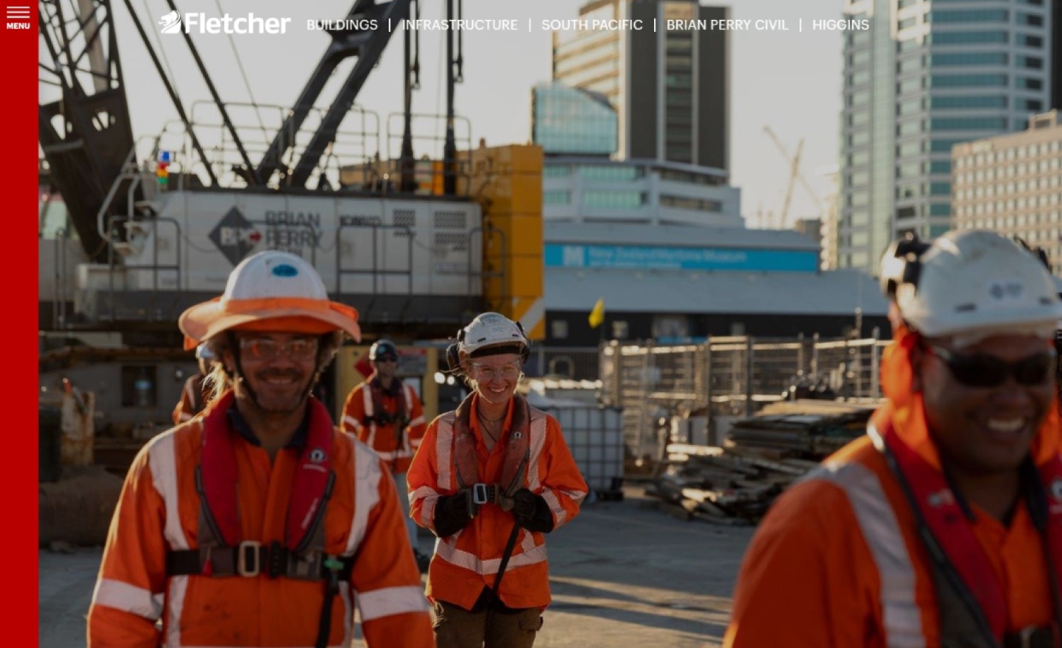
fletcherconstruction.co.nz
27. Snyder Construction Group
Why it works: The alternating dark and light sections within the home page create a break and makes well-organized content. The color palette is very appropriate for construction industry websites. The site has a large secondary call to action before the footer.
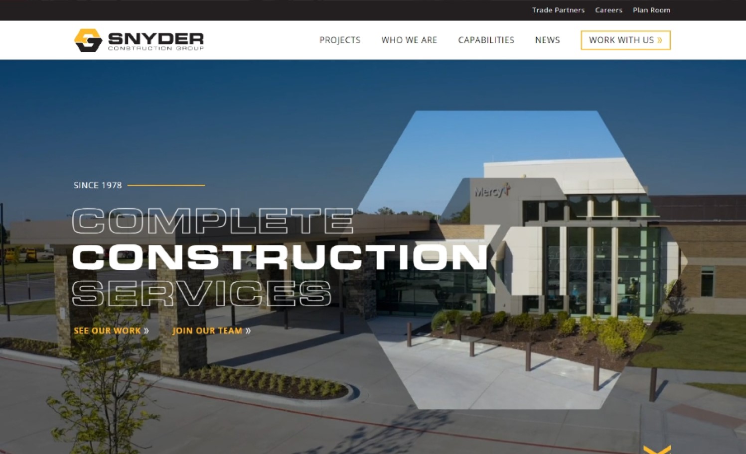
snydercg.com
28. Duquette Construction
Why it works: The layout of this web design is very different from other sites. The primary viewport remains static, while the content changes due to the transition effect. This page’s sections are creatively designed and implemented.
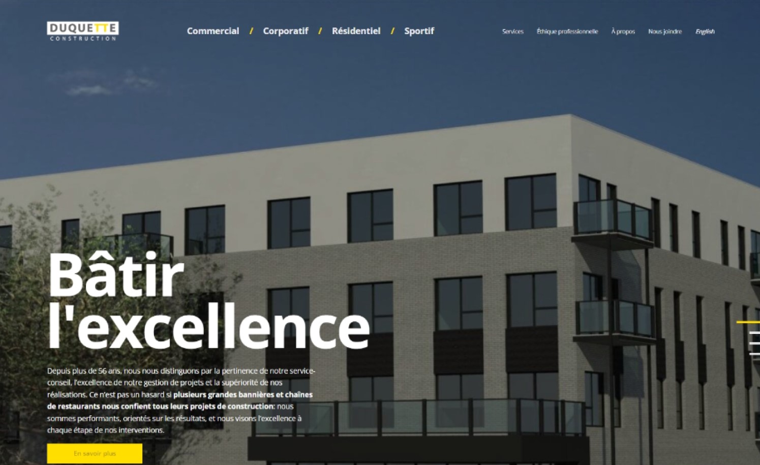
duquetteconstruction.com
top construction websites
29. Rodan Builders
Why it works: The Rodan Builders’ web design employs a variety of methods to emphasize the firm’s achievements, including portfolio area, statistics & metrics, client logos, job listings, social media feed integration, and more. All the services pages are extremely thorough and well structured.
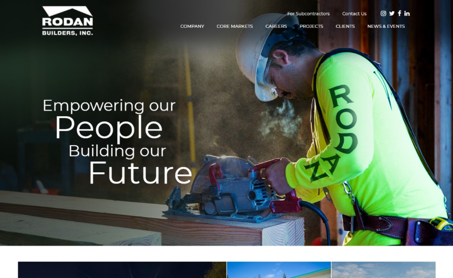
rodanbuilders.com
30. Gordon ‘N’ Gordon
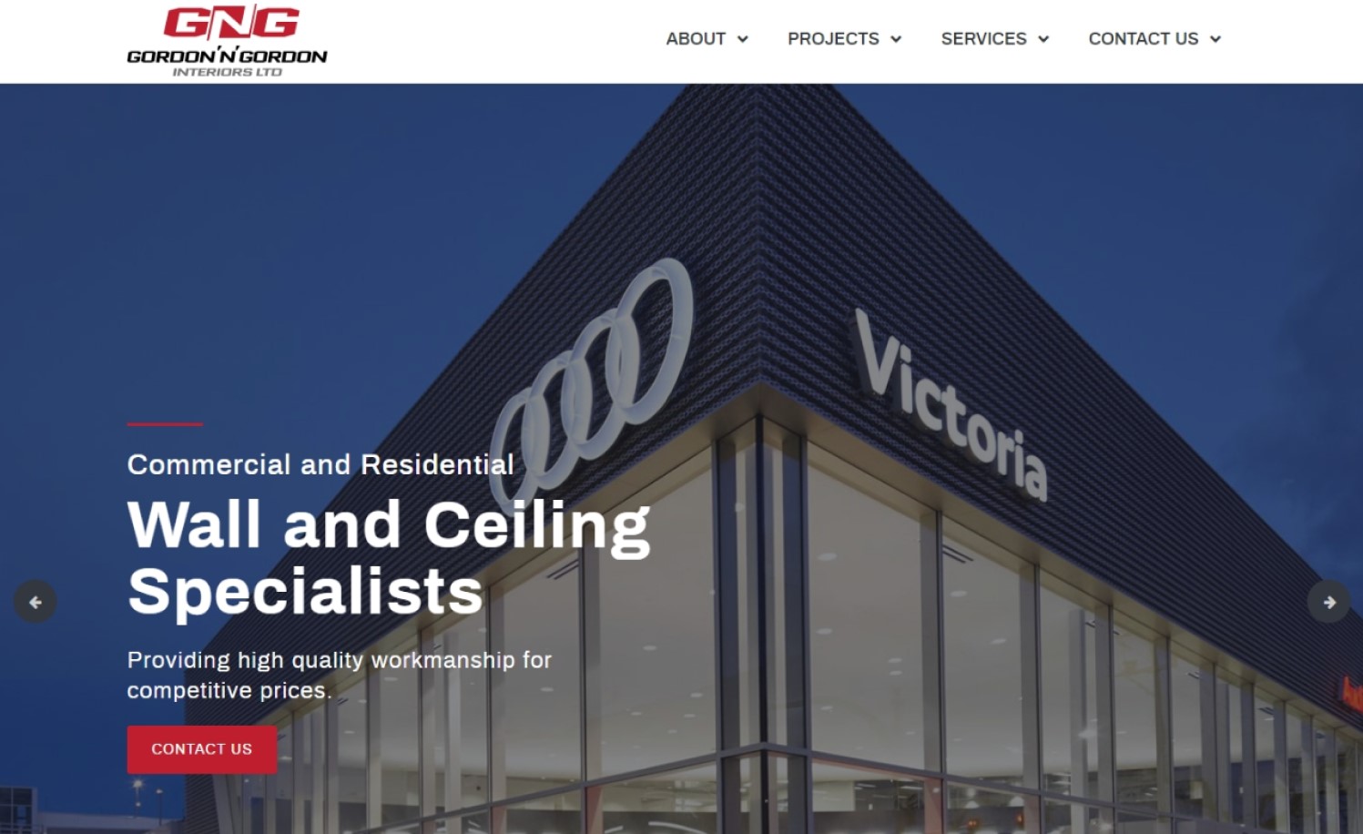
Why it works: Each section of this construction website’s home page is well-identified and links to specific inner pages. The subtle on-hover effects are functional as they display additional information. The clear call-to-action and footer are both effective and useful.
gordonngordon.com
31. Recycl8
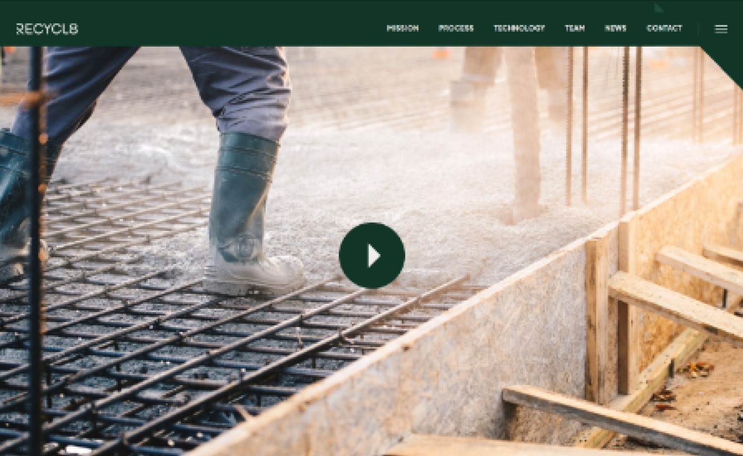
Why it works: The statement of purpose is simple, clear, large, and. The subsequent parts are also easy to comprehend. The subtle transition animation adds life to the page. Amazing functionality on the “Our Process” section.
websites for construction
32. Final Touch Carpentry
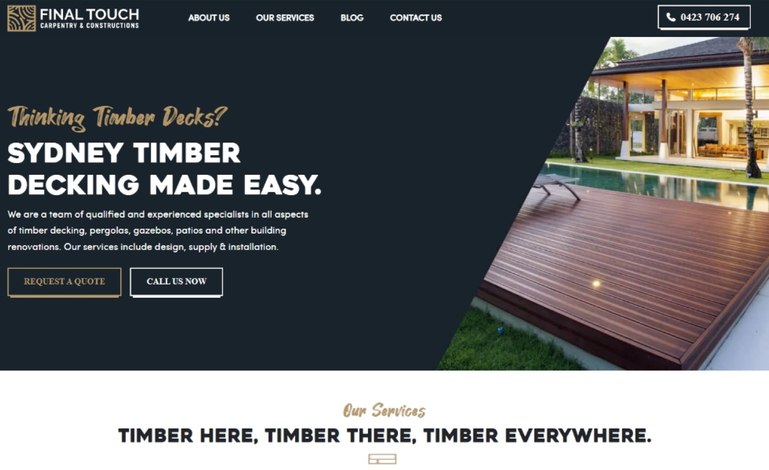
Why it works: The use of custom handwritten typefaces with serif fonts gives the website design a sense of creativity and an approachable nature. The main and accent colors go well together. It is a wonderful idea to include photographs of actual crew members at work.
ftcc.com.au
33. GM Construction
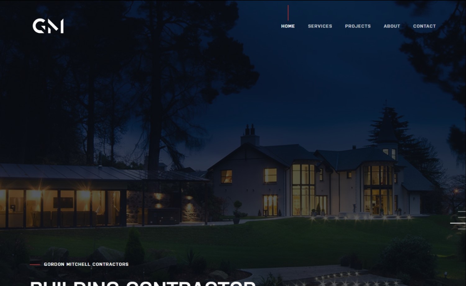
Why it works: The GM Construction web design is attractive and cutting-edge. Elements are well nested in each part of the site making it easy to navigate. Balanced spacing, well-blended hues, appropriate website design elements, lovely picture placement, and subtle hover effects are among the other noteworthy features.
gmcontractors.co.uk
34. HOUS Luxury Homes
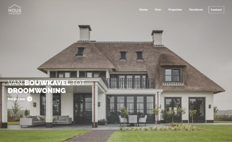
Why it works: This Netherlands-based company has a very minimalist web design. The whole home page is clean and unblemished. Unlike many construction websites in the US, most European websites share this trait. The negative space around content sections makes browsing this site a refreshing experience.
hous.eu
35. W.S. Cumby Construction
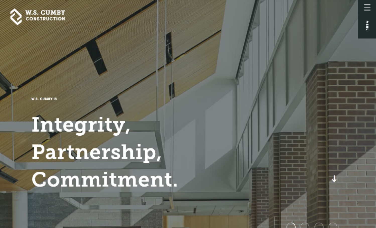
Why it works: The elements in this construction business website is placed in such a way that it creates a unique and somewhat original identity. Even the images used do not follow a strict and fixed dimension. The logo graphic is re-used in different sections using different styles that reinforces branding.
cumby.com
36. Vougan
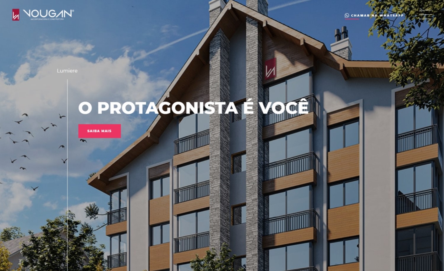
Why it works: The site has large images accentuated with transition animations and large heading fonts. The primary color is very striking but for some reason, the white text over it looks very appealing. All the pages are similarly beautiful and a please to browse through.
vouganincorporadora.com.br
Best Websites for Construction
37. MARTIFER Group
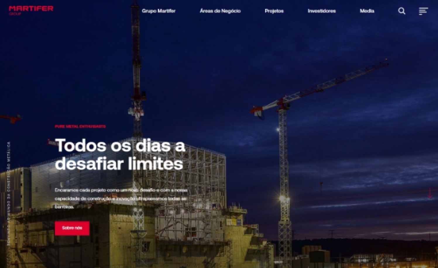
Why it works: The Martifer Group’s site is a great example of exactly what a modern construction website looks like. The site uses extra-large typography as a web design element between some sections. Some sections have unstructured and creative containers, overlapping text and images.
www.martifer.pt
38. EHA Group
Why it works: The home page of this construction firm is divided into sections that may be viewed on one screen at a time. This minimizes too many elements and makes it easy to navigate. The big, bold typefaces provide emphasis as well. The consistent color usage and eye-catching designs ensures visual appeal.
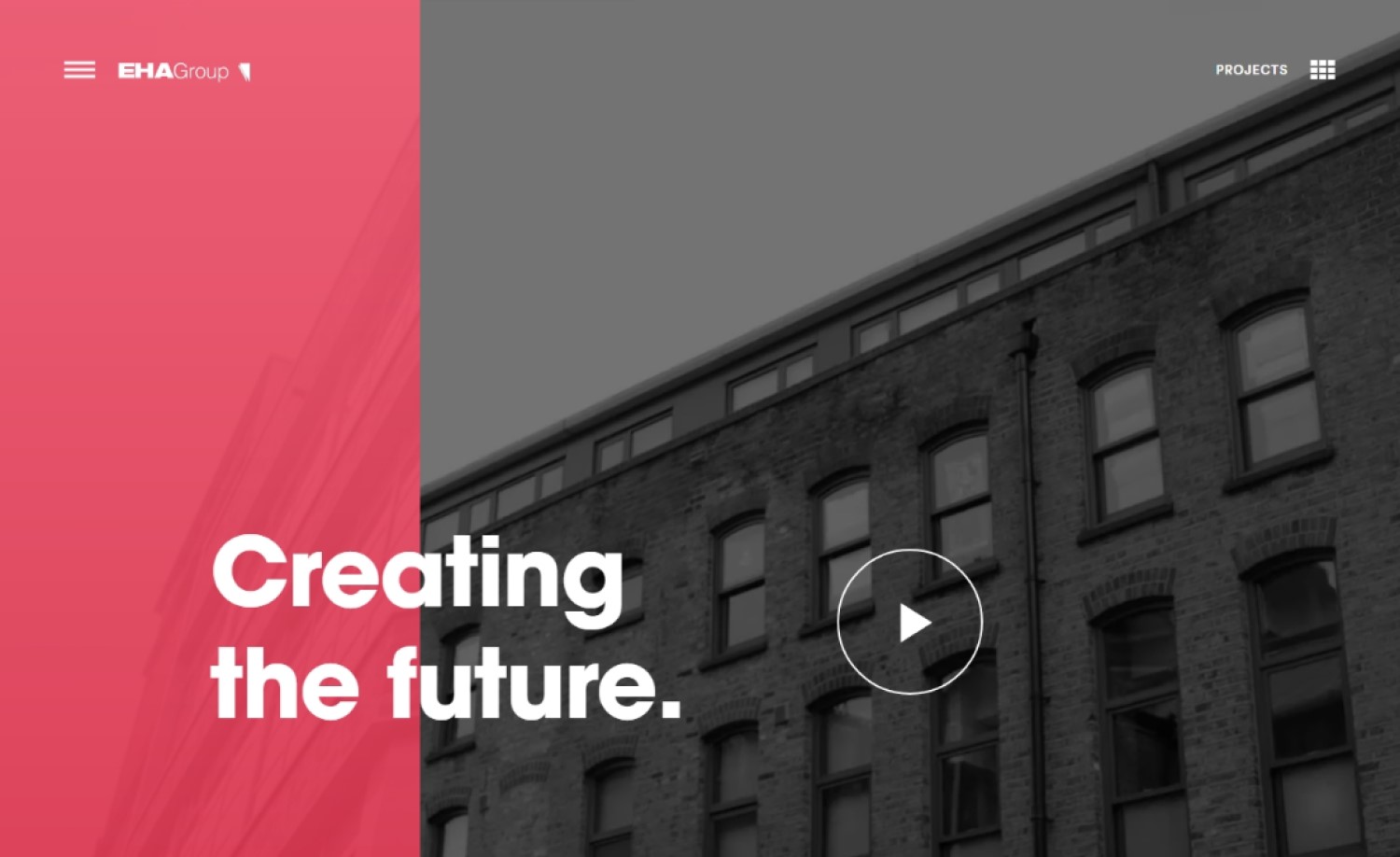
ehagroup.co.uk
39. Belmark Nightingale
Why it works: The Belmark Nightingale website is stylish and up-to-date. The photographs on the site are exceptional. The web designer did a great job with the alignment and positioning of heading and content text.
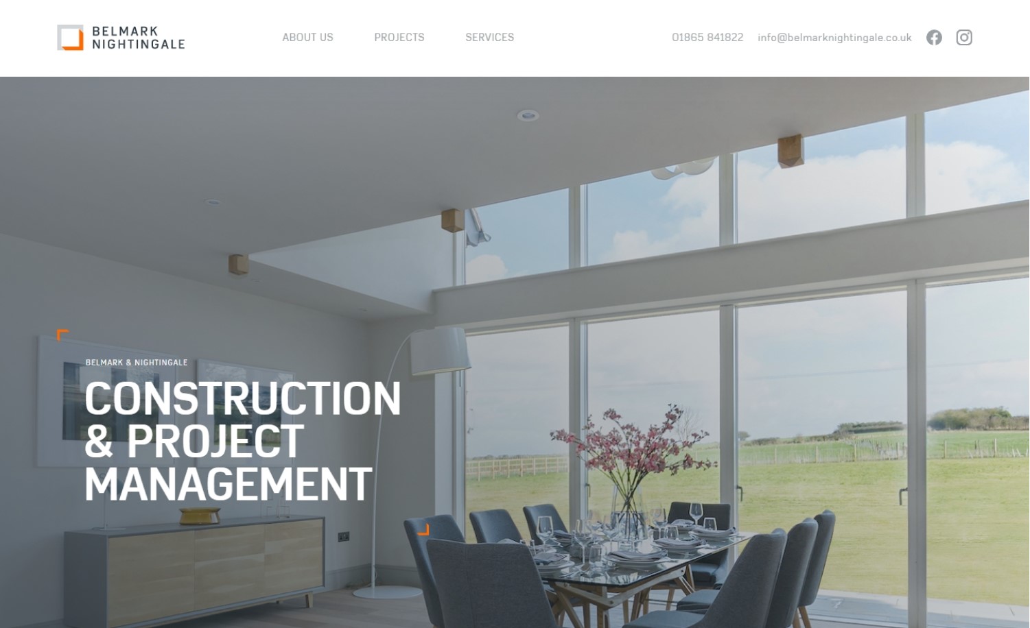
belmarknightingale.co.uk
40. Blach Construction
Why it works: The website’s straightforward structure makes this commercial construction website easy to navigate, resulting in a pleasant experience for visitors. The on-scroll animation effects add life to the website and help to add focus to content.
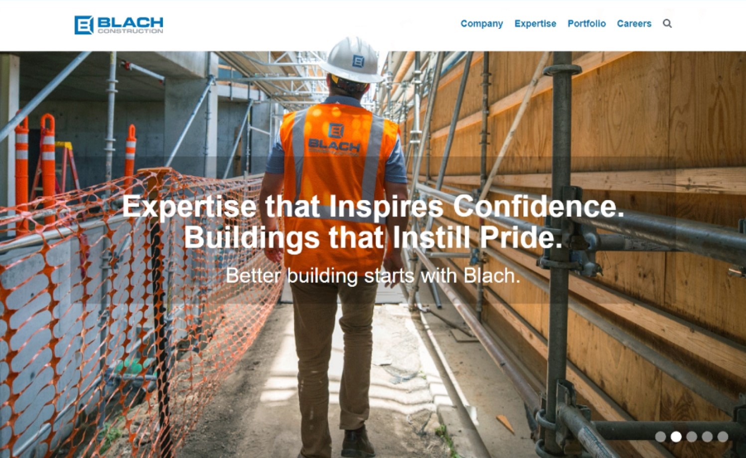
blach.com
Conclusion
If you’re a business owner in the construction industry, then your website is one of the most important aspects of running a successful business. It’s also challenging to find websites that are well-designed and correctly represent a company’s brand. We’ve compiled this list for you from countless websites around the web which we hope will inspire you!
If your company is looking for someone to rely on to deliver not only the best construction website but a great experience throughout the process, then count on us. We will design a custom mockup of your new website before you sign or pay for anything. There is nothing to sign and no payment information will be taken. If you like our design for your business we can move forward working together. If not, there are no hard feelings and no other obligations. Click the button below to learn more.
