These days B2B websites are the new B2C. B2B has increased in popularity over the years with many companies realizing that B2B is a great way to make more money. We have searched around and found 40 of The Best B2B Websites on the internet. So if you’re looking for some inspiration, a free resource on what other companies or businesses are doing, then this article is perfect for you!
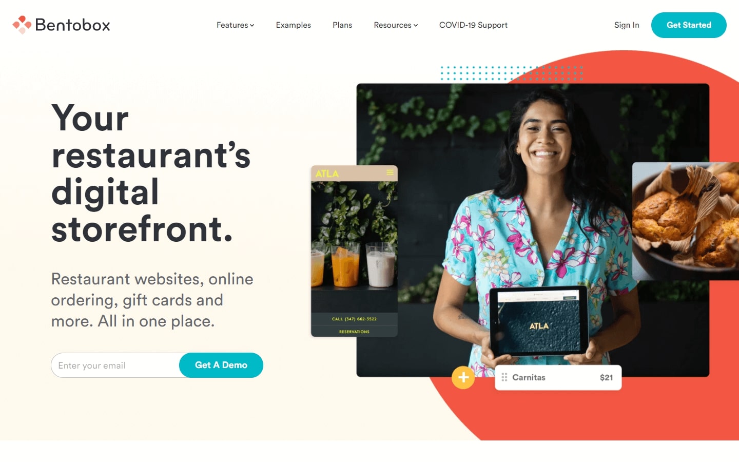
1. Bentobox
Why it works: With a youthful, friendly vibe and beautiful color combination, this website has an intuitive interface that’s easy to use. Plus it comes with animations that are fun to hover over!
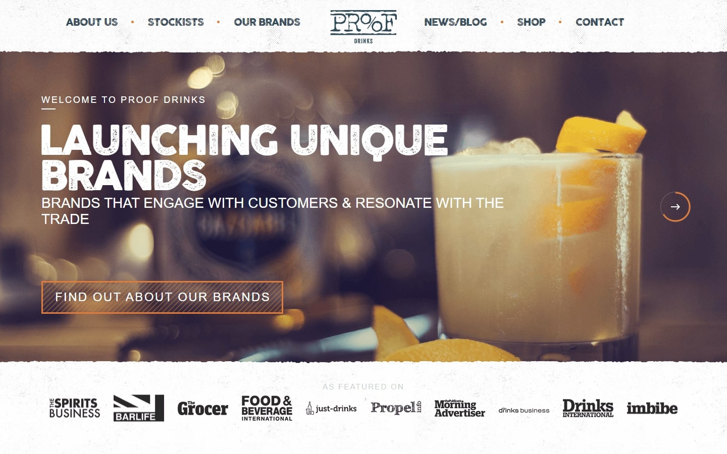
2. Proof Drinks
Why it works: This B2B website has beautiful images and textured backgrounds. The fonts are unique, and there is a creative image slider transition effect on the home page. The third-party media logos added credibility to the website.
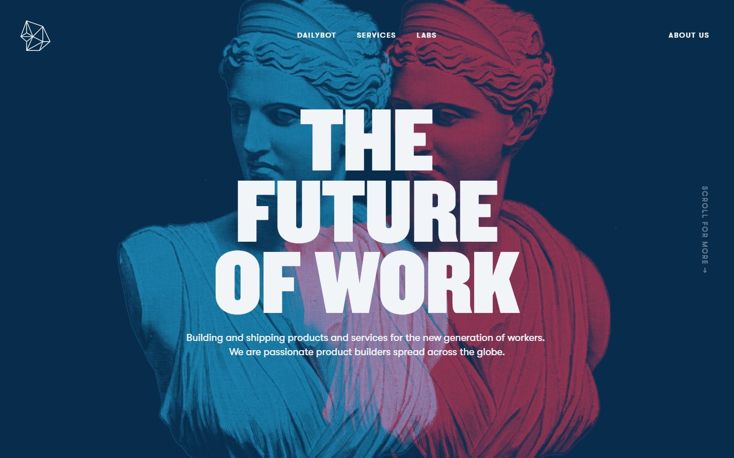
3. Rocka
Why it works: They made creative use of color transition effects and background animations in this B2B website. The company also has differentiated its brand by using large and bold heading fonts as well as favoring non-conventional photographs for their type of business. One can also observe the good contrast between text and background which makes it easy to read.
BEST B2B WEBSITES
4. Pixelgrade
Why it works: A website that will catch your customers’ eye. This B2B website design with large, readable fonts, trendy colors and irregular image containers surely makes an impression. You won’t want to forget the on-scroll animations or the strategically placed testimonials that’ll help build trust. The use of consistent design elements is crucial to making a cohesive, on-point website.
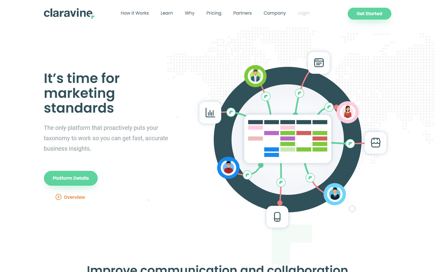
5. Claravine
Why it works: The B2B website is attractive and offers a good user experience for visitors. It also has some neat features like animations and beautiful dropdown menus.
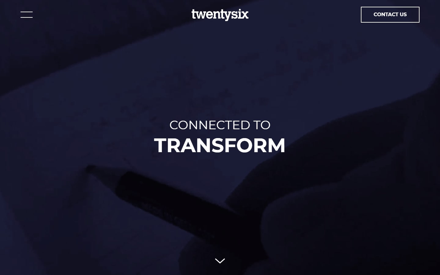
6. Twentysix
Why it works: The hero video background with a color filter for increased contrast provides a focus on the heading text. The website is designed with spacious content sections that are clean and easy to navigate. Call to action buttons are prominent creating an opportunity for visitors to engage.
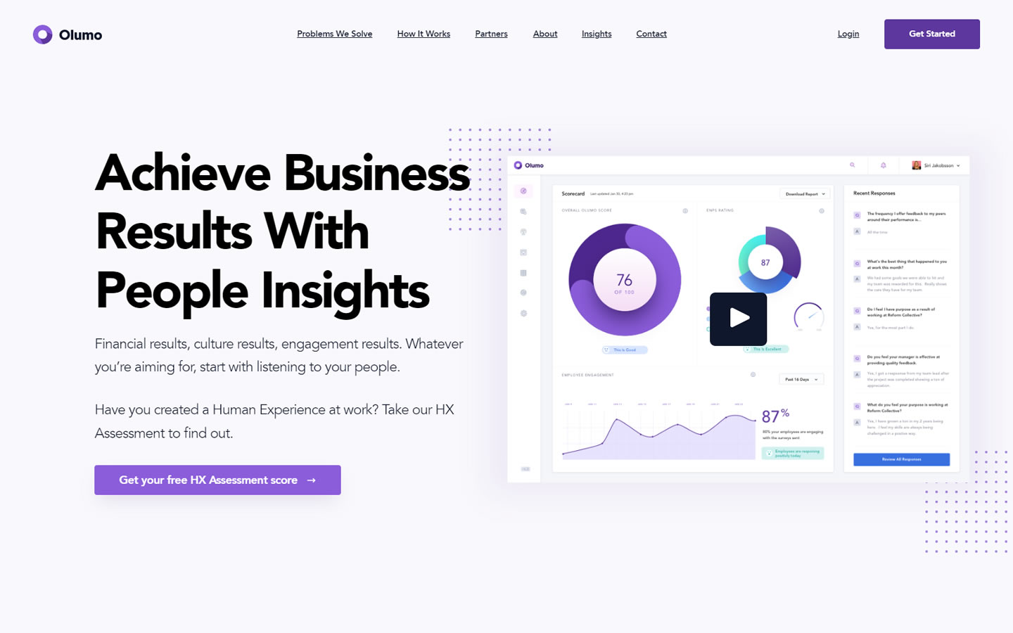
7. Olumo
Why it works: This B2B website uses bright and trendy colors. The large headings, custom images and negative spaces were used to create a playful alignment of web design elements.
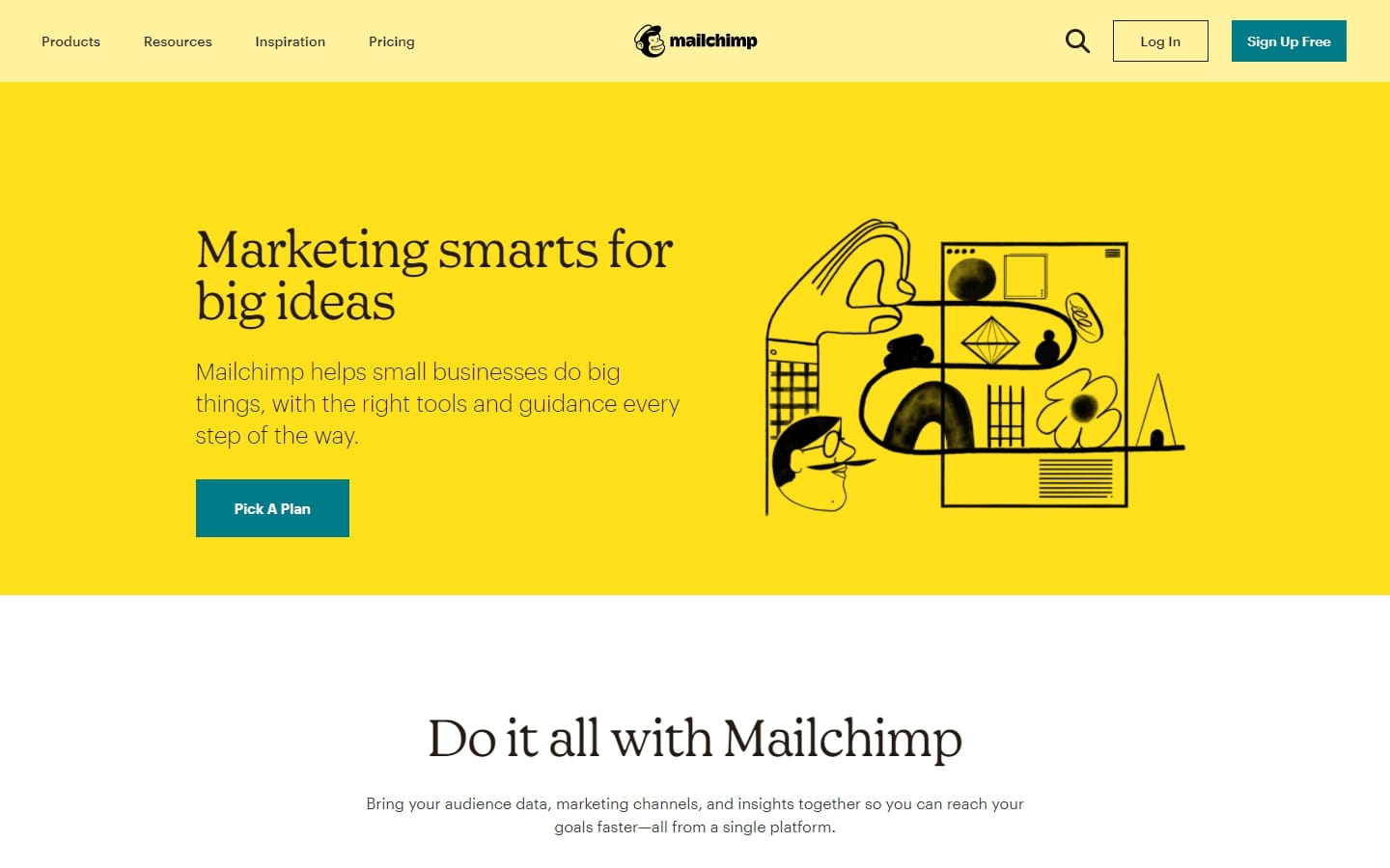
8. Mailchimp
Why it works: The website used high contrast colors to create a playful web design. They included serif headings, consistent alignment of various elements, and large negative space for extended readability.
B2B WEB DESIGN
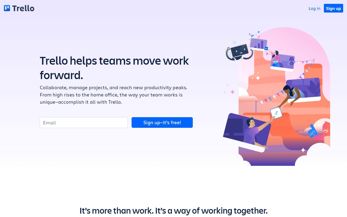
9. Trello
Why it works: The combination of pastel colors, custom graphical elements, and fonts made the web design both beautiful and professional. Clients’ testimonials are prominently displayed along with company logos of customers to show you how proud they are! The layout is clean and consistent throughout.
10. Exstratus
Why it works: The B2B website consists of a nice balance between clean sections with large whitespaces throughout. The graphics, photos, and background images are subtle enough not to take away from the content of the page but still add to its appeal. The professional fonts and color hue change on images create contrast while highlighting just how professionally executed this website is.

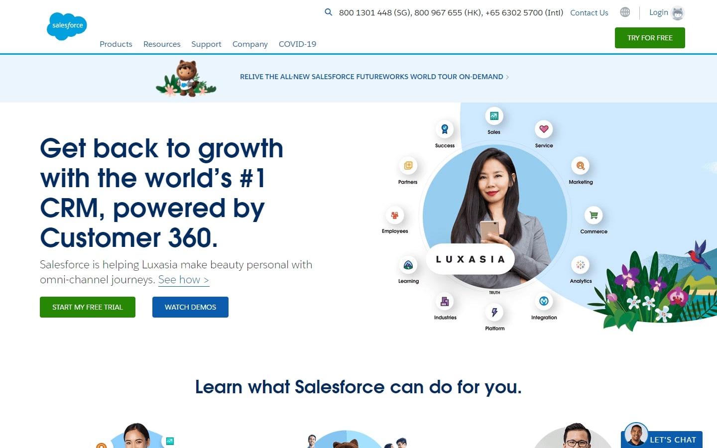
11. Salesforce
Why it works: The graphics are a blend of different formats and colors by merging photos, drawings and shapes. The inner pages are not bland and still contain much of the formatting found on the homepage.
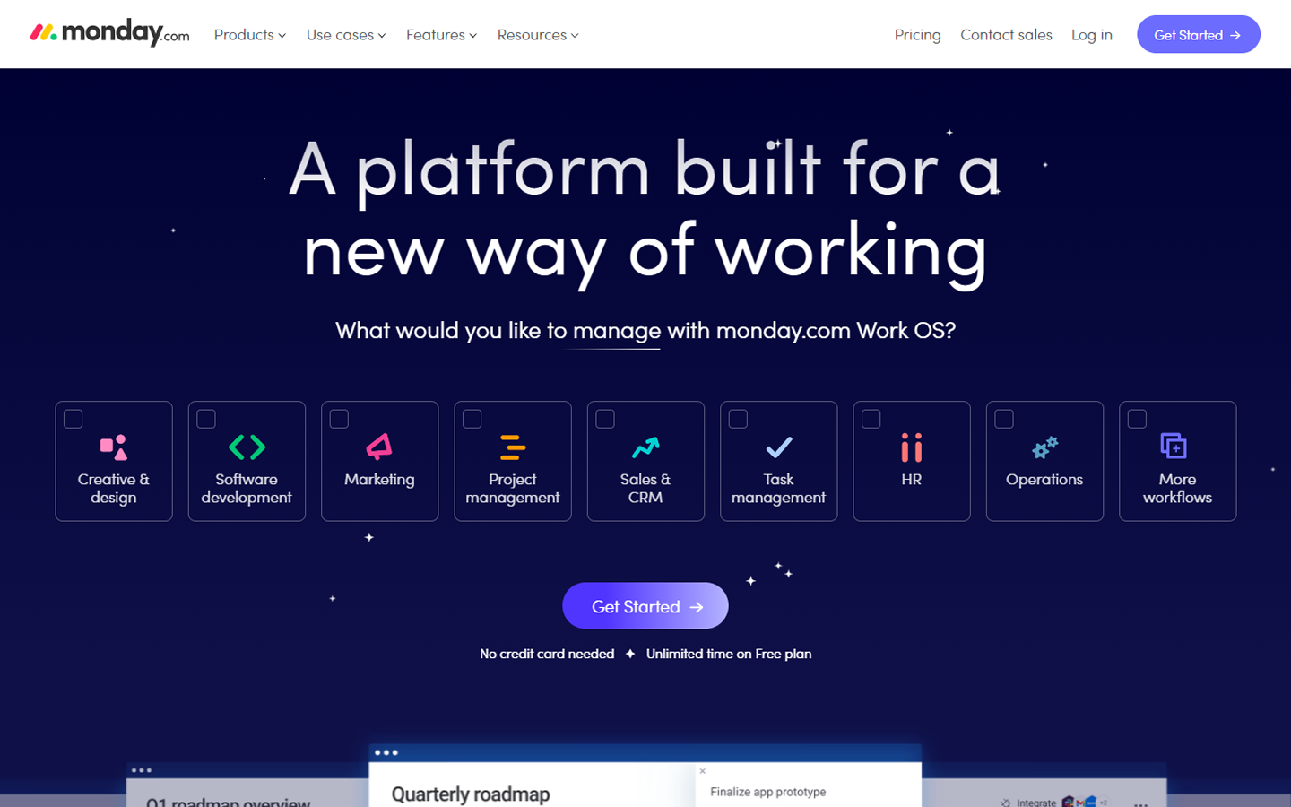
12. Monday.com
Why it works: Custom graphics and creative mouse-over effects that use the company’s brand colors. Inclined section dividers and colorful icons to highlight key content. Visible navigation and main call to action button make it easy to find what you want.
13. SaturnCloud
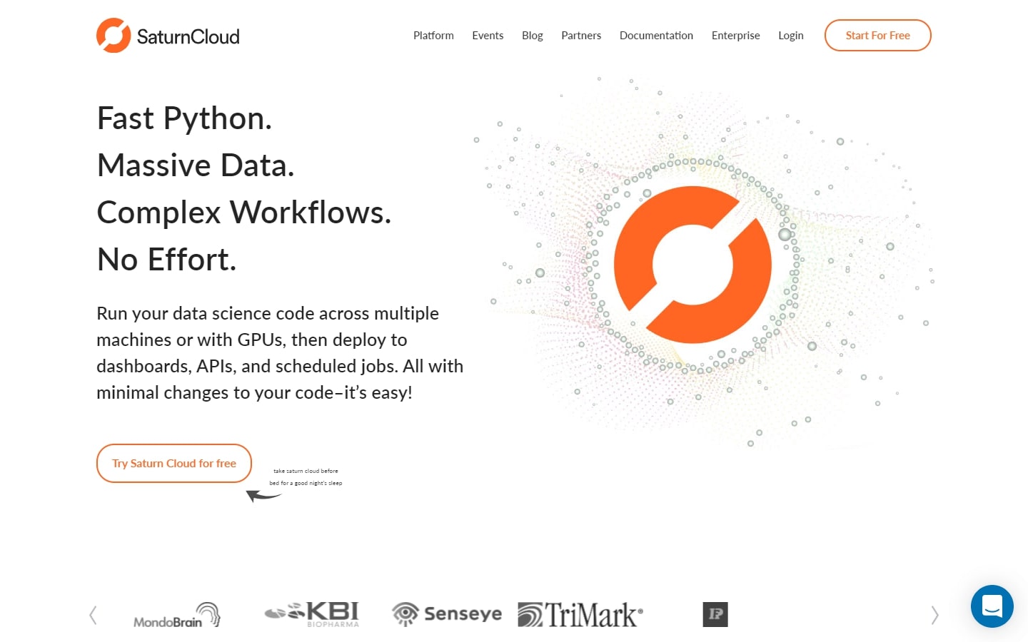
Why it works: The website is visually appealing with custom icons and graphics that blend well with the modern design. The customer logos are prominently displayed on the homepage. Events and blog posts are always up to date.
Website Design for B2B
14. TechD
Why it works: The website has well-defined page sections, consistent use of colors and custom graphics. Well-organized content despite the huge amount of information available on the website. Full-blown comprehensive and easy-to-read footer.

15. Envoy
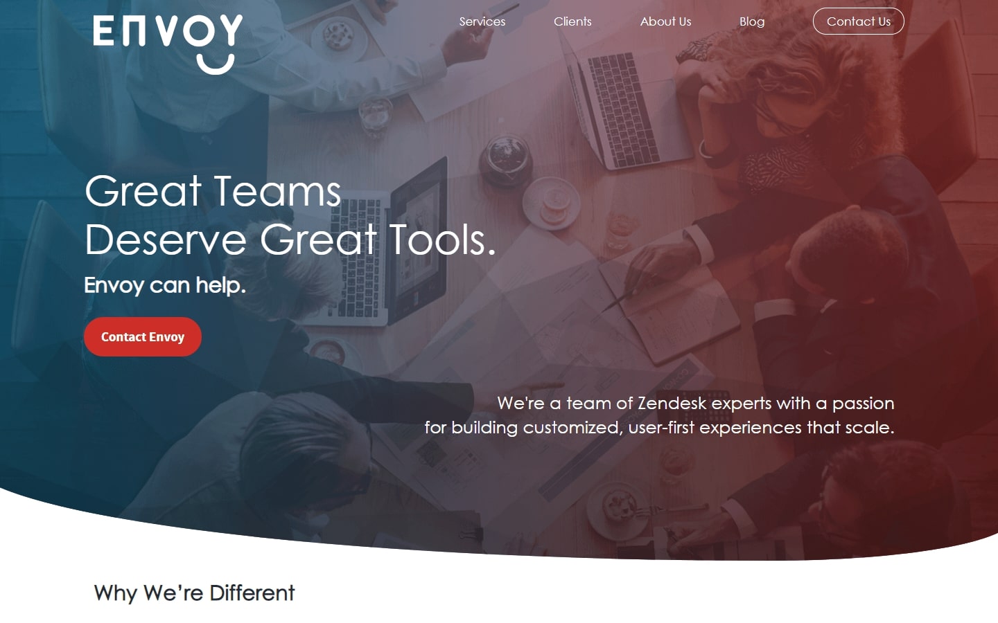
Why it works: This site features creative and consistent use of great design elements in the homepage and inner pages. Concise but informative content. The website has a very simple footer with a contact form.
16. Datatron
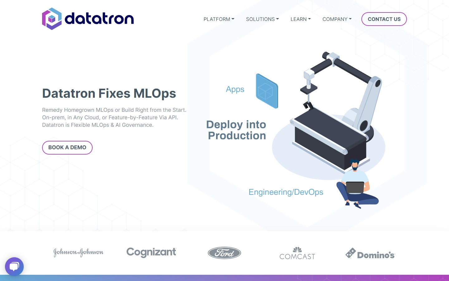
Why it works: The tech website is very informative and professional. Tech enthusiasts would love the custom SVG animations and cool button hover effects that add a “techy” feel to the site. The colors used are consistent and are based on the company logo.
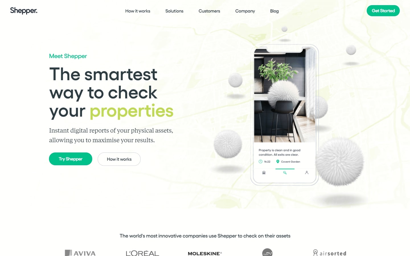
17. Shepper
Why it works: The website utilizes trendy colors, large but sleek fonts, nice animations, custom graphics and icons. The effective use of white space, video integration, plenty of negative space between elements and content makes the website engaging and on point.
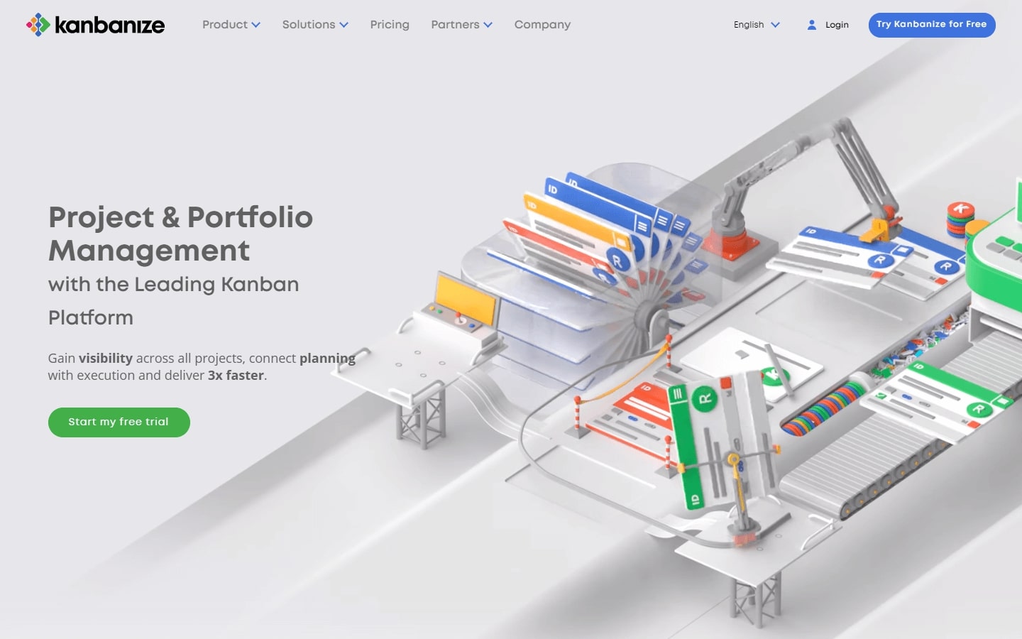
18. Kanbanize
Why it works: The website includes custom animations, colorful icons, and interactive client testimonials to facilitate the visitors’ discovery of information. The website is very easy to navigate due to the clear sections, fixed navigation, and detailed footer.
b2b web design best practices
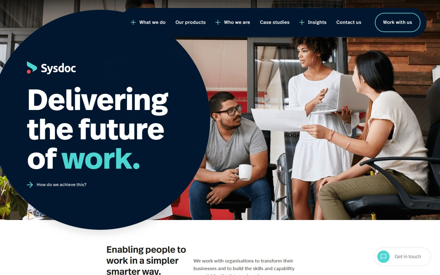
19. Sysdoc
Why it works: Large and high-impact statement of purpose with easy to read content sections. The colorful yet professional-looking website has beautifully crafted inner pages that borrow design elements from the homepage.
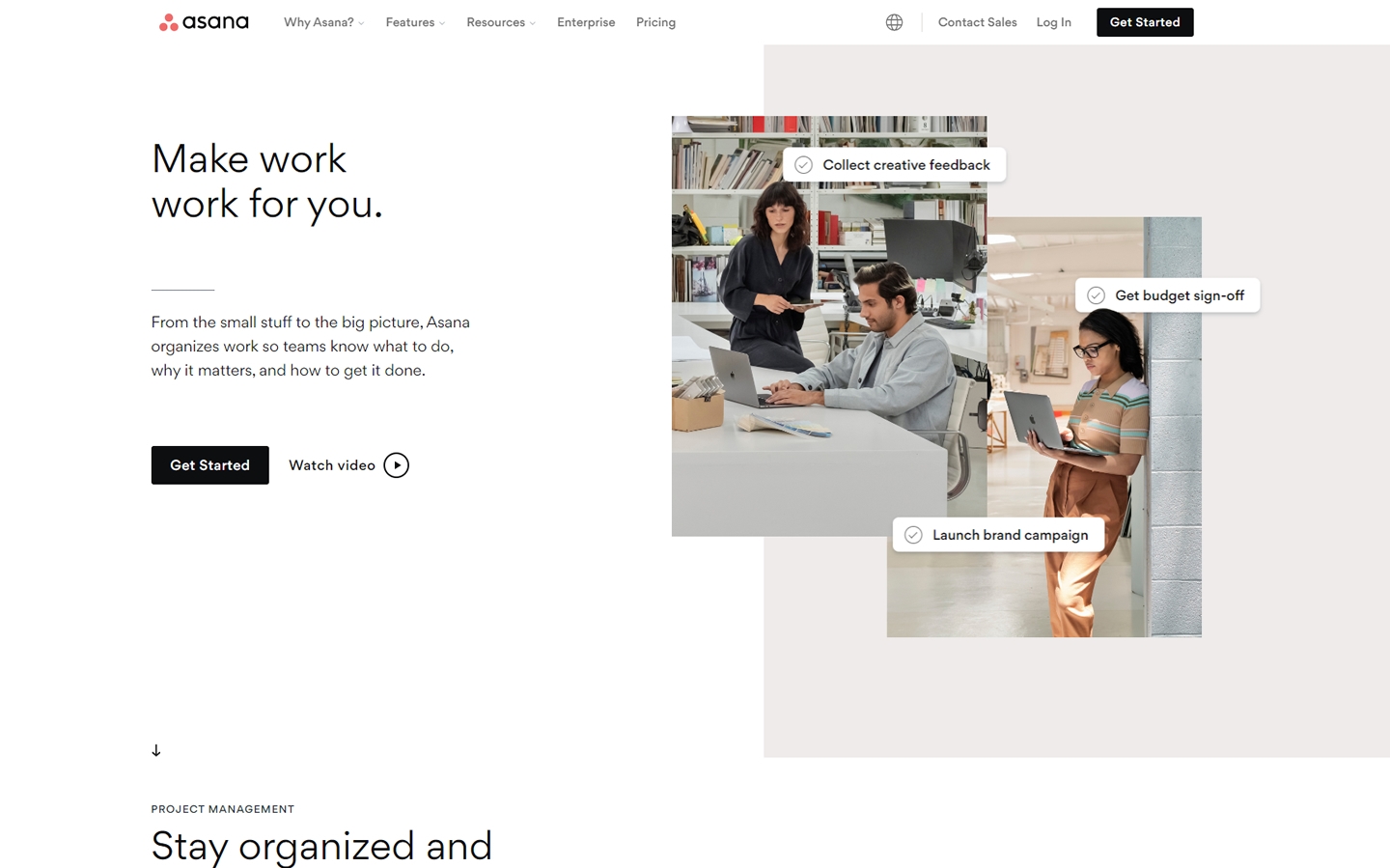
20. Asana
Why it works: The unique split-screen layout on the hero banner, dynamic scroll-activated animations and animated diagrams will surely leave an impression on the site visitors. Inner pages are beautiful that looks like a unique homepage. The footer section is well-organized.
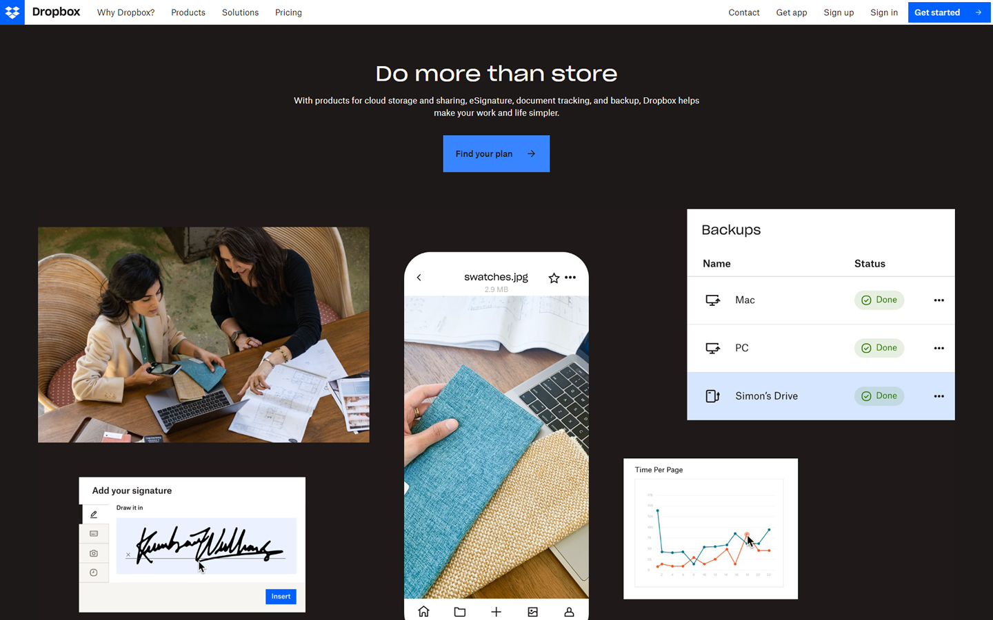
21. Dropbox
Why it works: This website utilizes a fixed navigation section with custom animated graphics and icons. The client testimonial section is unique. Simple and clear call to action and footer links.
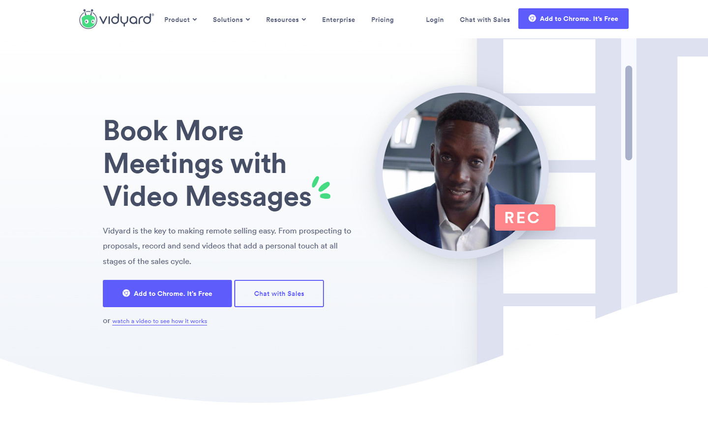
22. Vidyard
Why it works: Great alignment of elements with gentle modern design features. This site employs stunning dropdowns and beautiful animation to elevate the product.
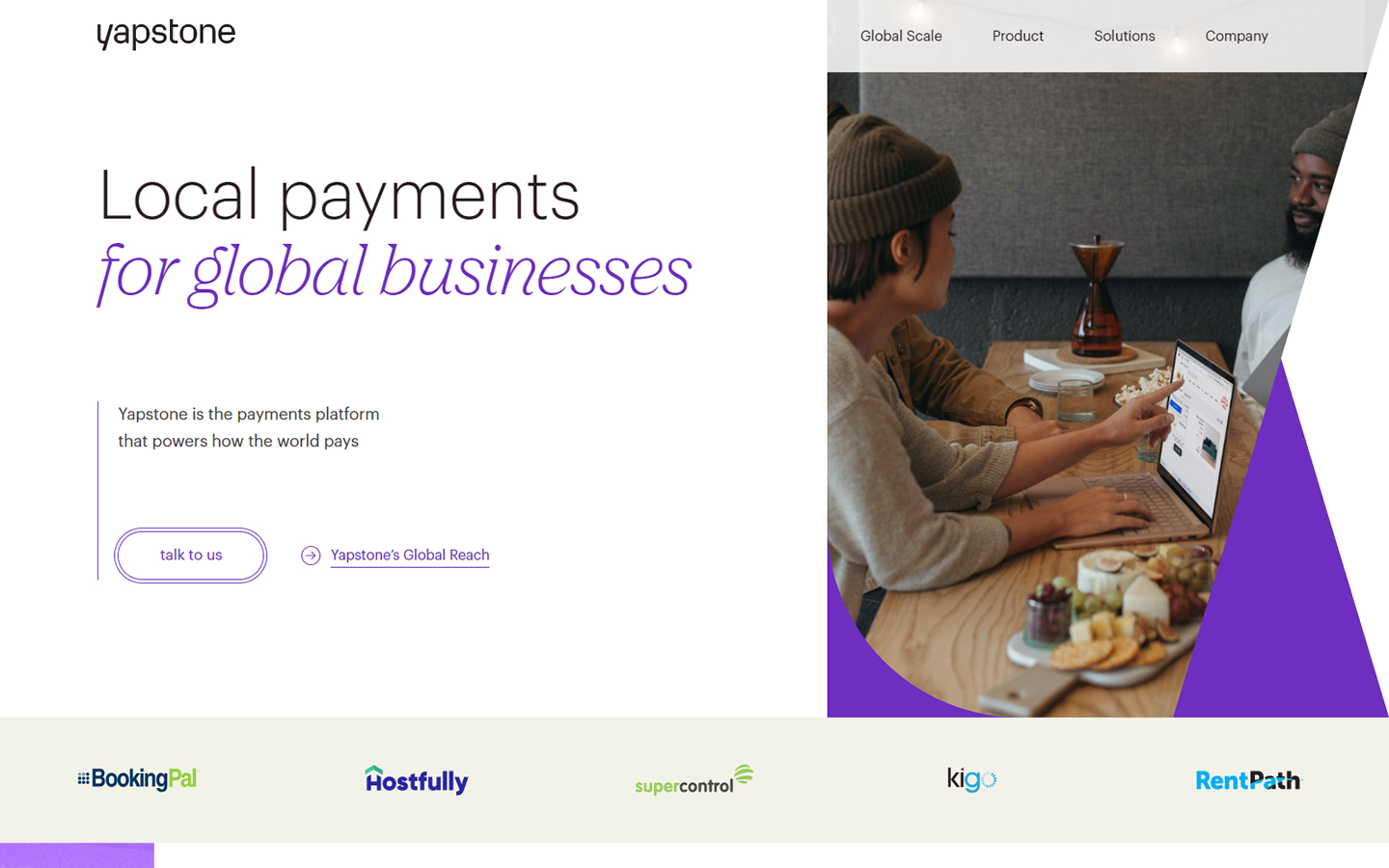
23. Yapstone
Why it works: The homepage showcases an unconventional hero graphic with thin and large heading fonts. Custom graphics are seen on the homepage and inner pages. Large white space between sections makes the website light and airy.
BEST B2B WEBSITE DESIGNS
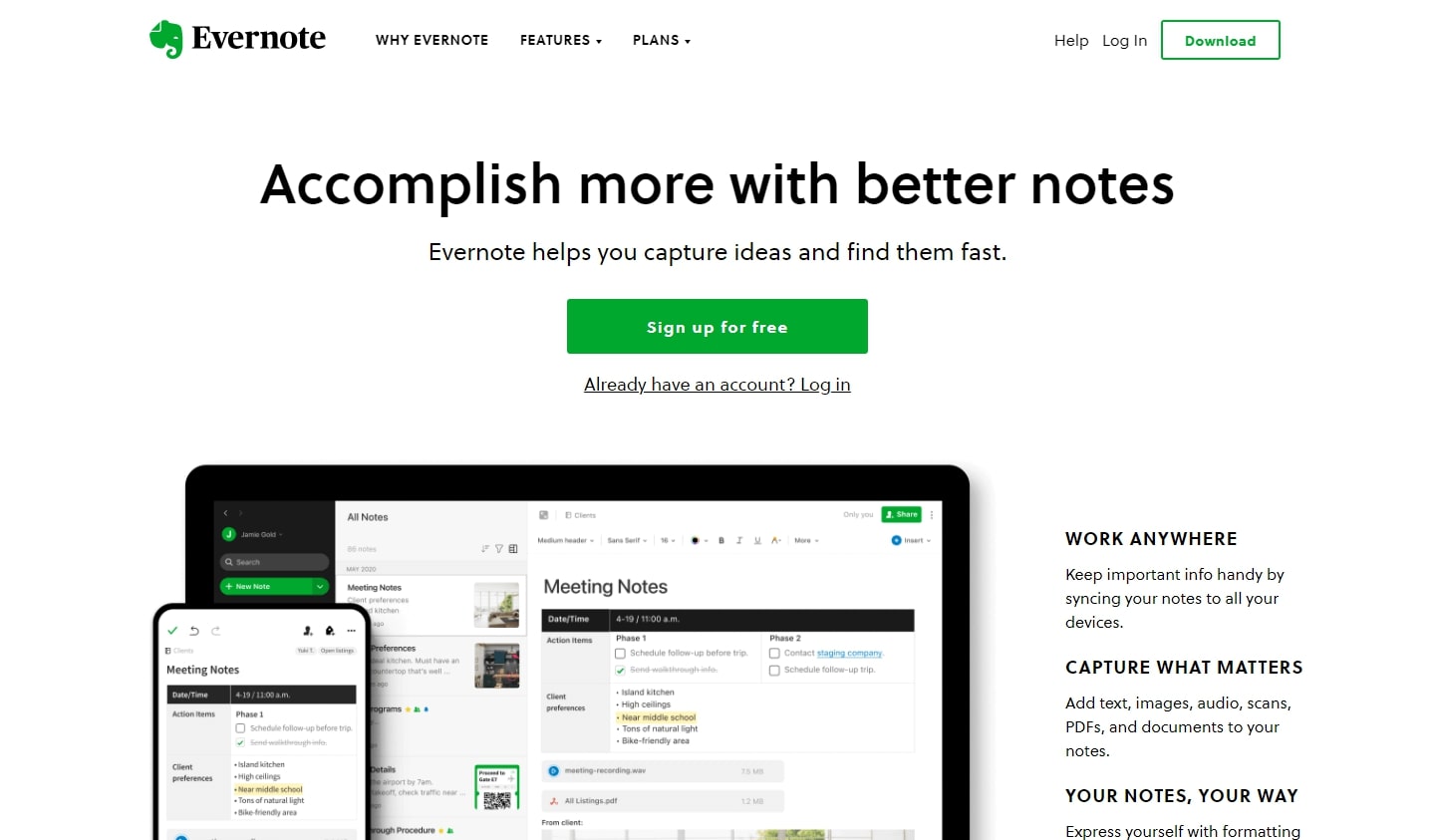
24. Evernote
Why it works: The clean and clear background from header to footer is balanced by the use of colorful icons and graphics. The pricing plan is visible on the homepage. The inner pages are very well designed and look similar to the homepage.
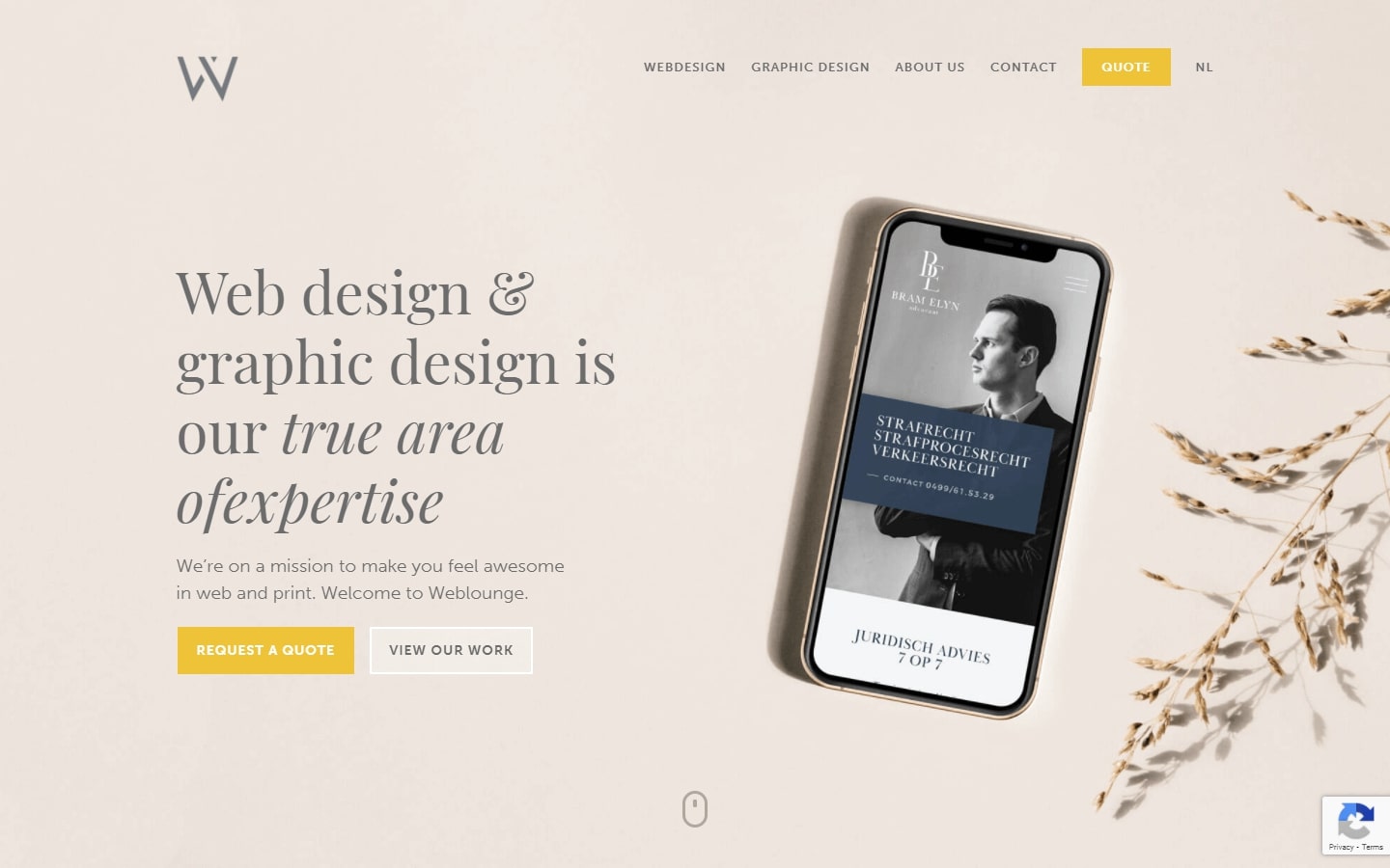
25. Weblounge
Why it works: The best part about this website is that it offers an immersive user experience. The colors, fonts, and photos make the website look classy and sophisticated. The creative mouseover effects and transition animations add a touch of flair to the site. A unique call to action button can be found in the full page footer.
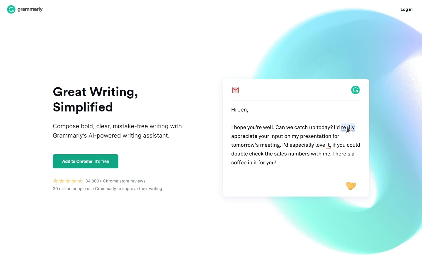
26. Grammarly
Why it works: This is a great example of the effective use of whitespace and light colors on a website. The sections are easy to read and view. Overall, this website projects simplicity that somehow creates a professional feel.
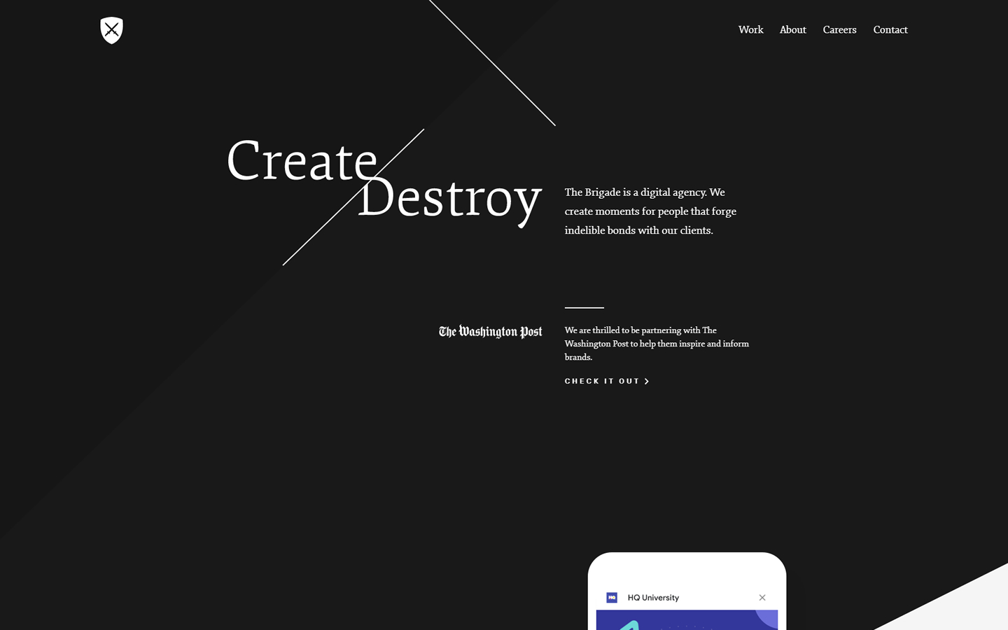
27. Brigade
Why it works: This site has a captivating hero banner with an unusual and unique layout. Large whitespaces between sections with consistent and well-blended colors. Animations are also seen in the inner pages.
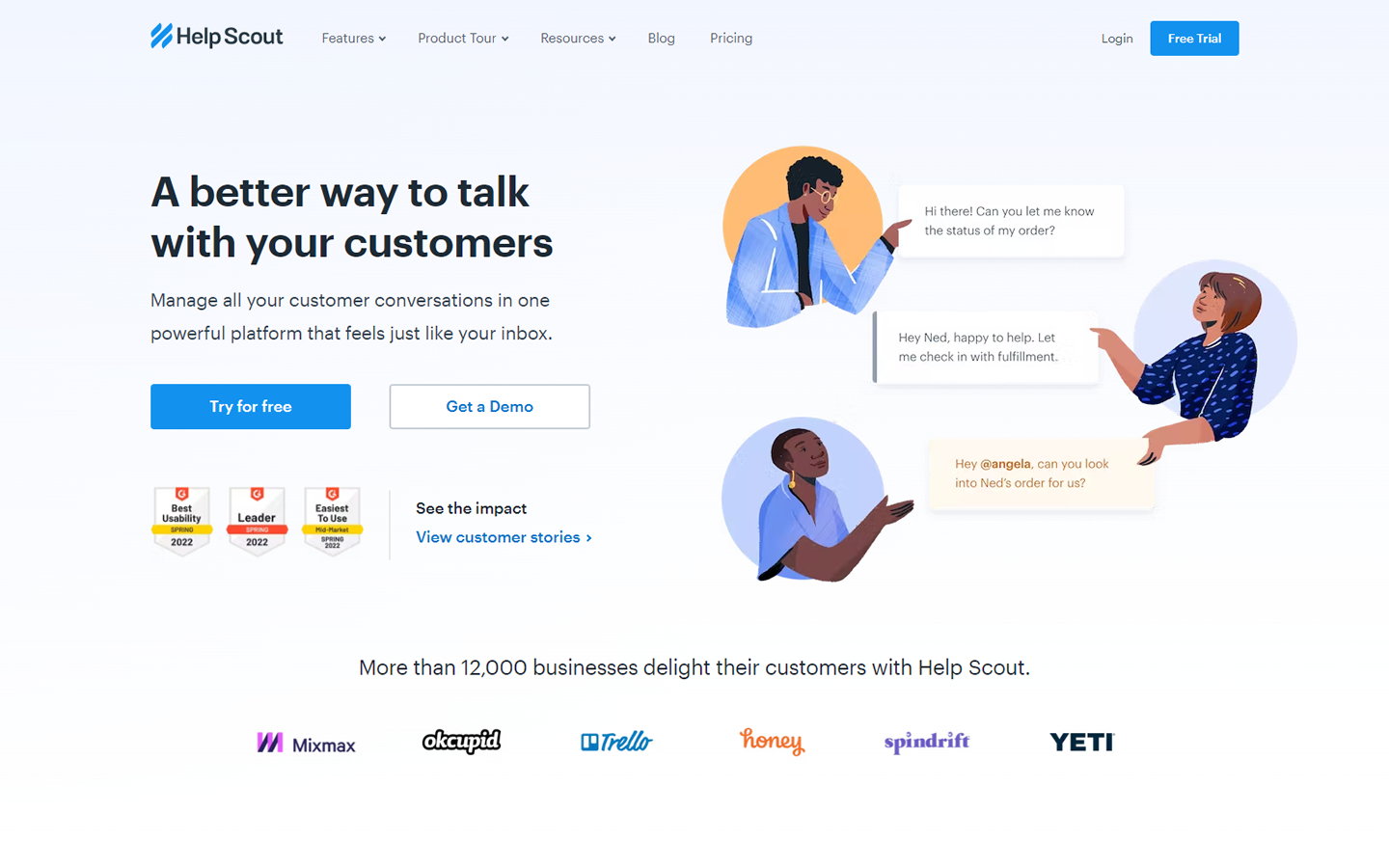
28. Help Scout
Why it works: This website is light and easy on the eyes. The content and sections are well-organized with strategically placed call-to-action links. Client logos were added for credibility. The custom graphics, gifs, animation effects add flair to this website.
TOP B2B WEBSITE DESIGN
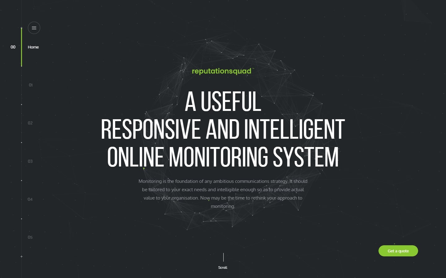
29. Reputation Squad
Why it works: This site uses a dynamic background that feels alive as visitors scroll through. The background also reacts to mouse movements, giving this website more interactivity. The viewport is fixed but the content moves and changes as you scroll.
monitoring.reputationsquad.com
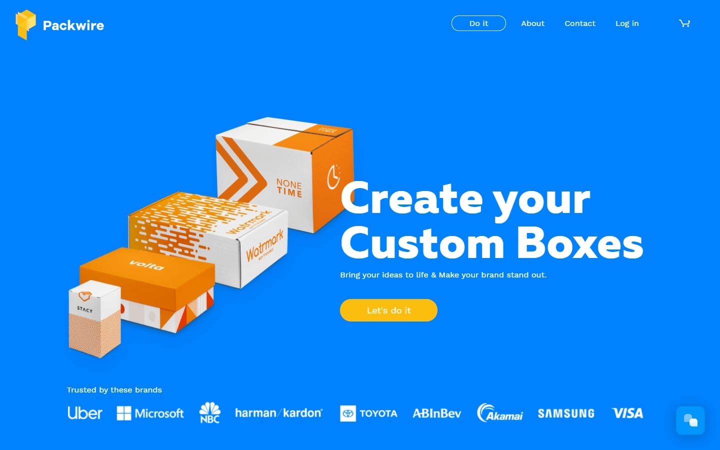
30. Packwire
Why it works: Beautiful transition animations during scroll are showcased on this website. Vibrant colors and amazing 3D product customization functions are seen on this site. The product stories on the blog page add focus to their exciting products.
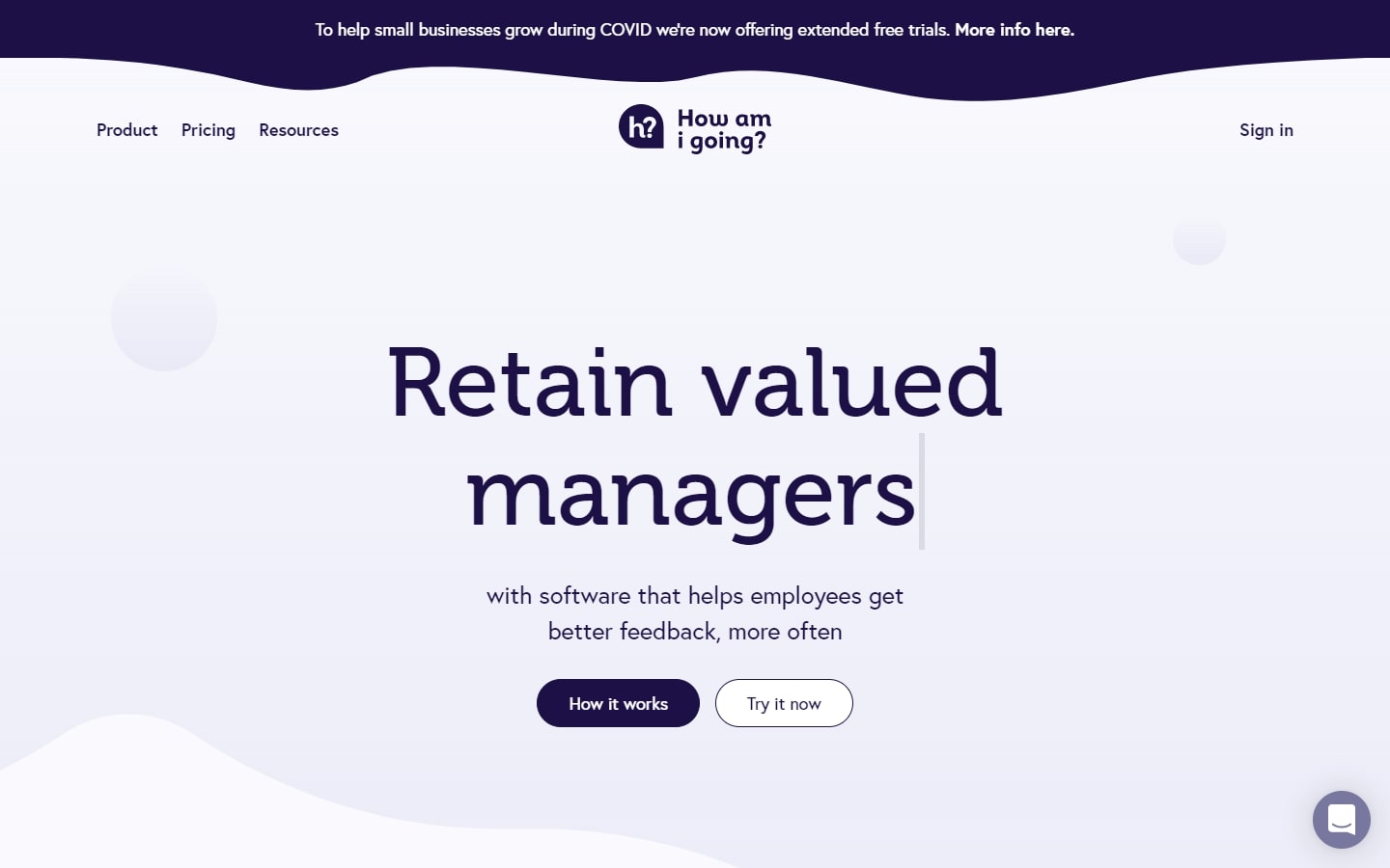
31. Howamigoing
Why it works: Consistent and minimal use of colors. Custom graphics with the use of wavy and rounded design elements and section dividers make this website unique. The client logos and video testimonials on this site are valuable sources of credibility.
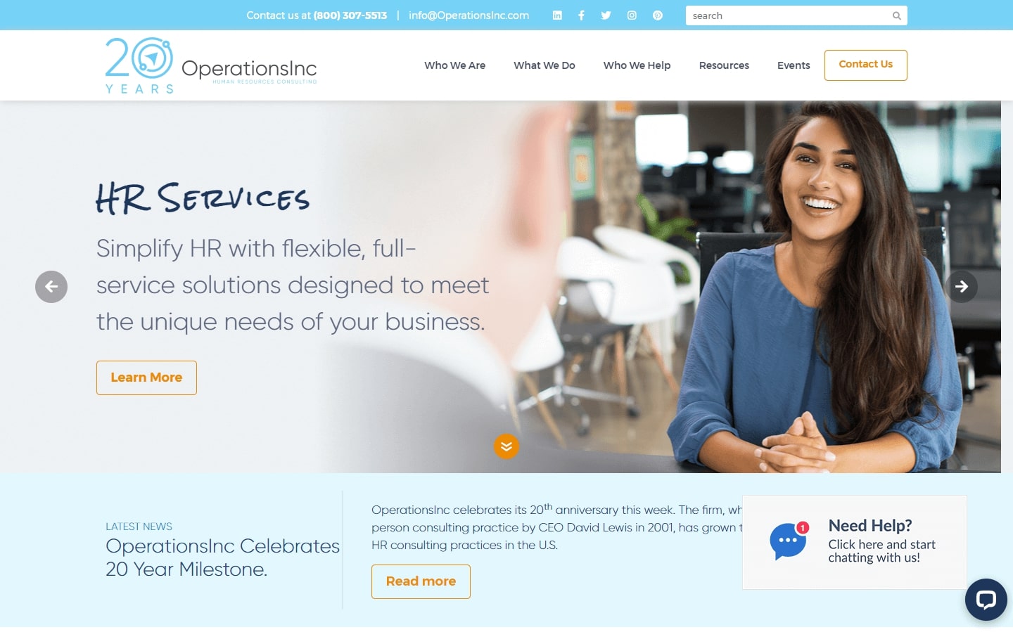
32. Operations Inc.
Why it works: The use of light colors and friendly typeface on this website provides a welcoming tone that makes the service seem endearing. Custom icons were used and a contact form is visible in the middle of the page.
33. Leader Success
Why it works: Beautiful hero section. The homepage features pictures of smiling people, vibrant colored accents, and custom icons. Once can instantly identify the call to action sections on every page.

B2B Website Design Inspiration
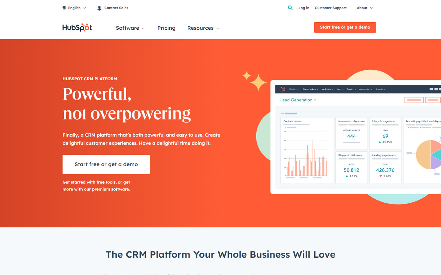
34. Hubspot
Why it works: The design of this website is user-friendly even on mobile devices. The clear and specific value proposition is stated in the hero section. They did a fantastic job of making all of their content easy to find and read.
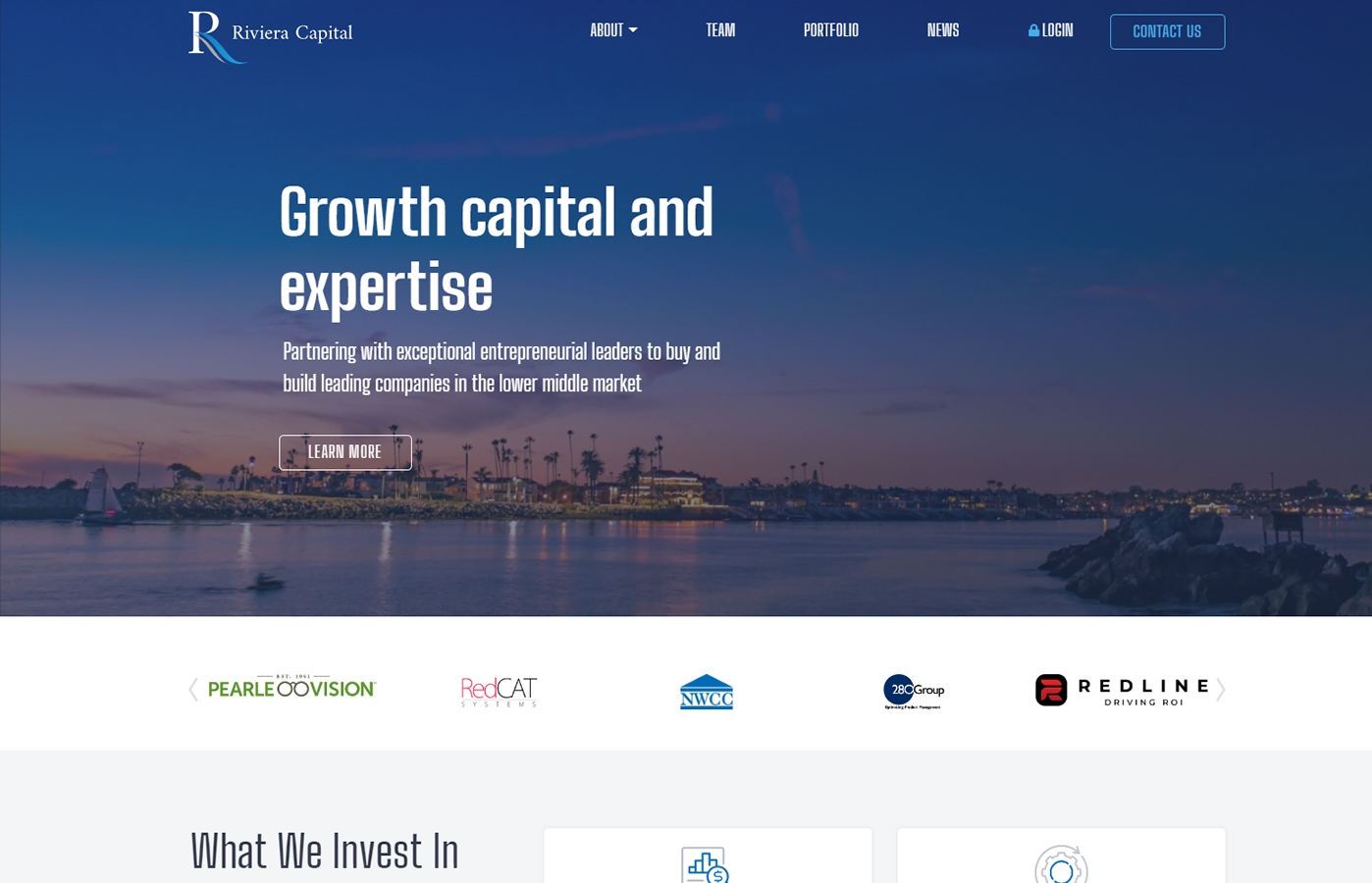
35. Riviera Capital
Why it works: The clean and professional implementation of the hero video retains readability for the company’s purpose. The use of diverse color schemes in client logos, sleek fonts with minimal section backgrounds, offers a fine contrast to them.
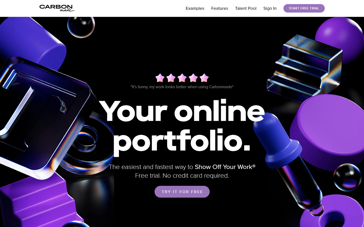
36. Carbon Made
Why it works: This website uses large heading font with vibrant and trendy colors. 3D elements are used consistently, the alignment is always perfect, and testimonials of clients are sprinkled throughout in various formats and designs.
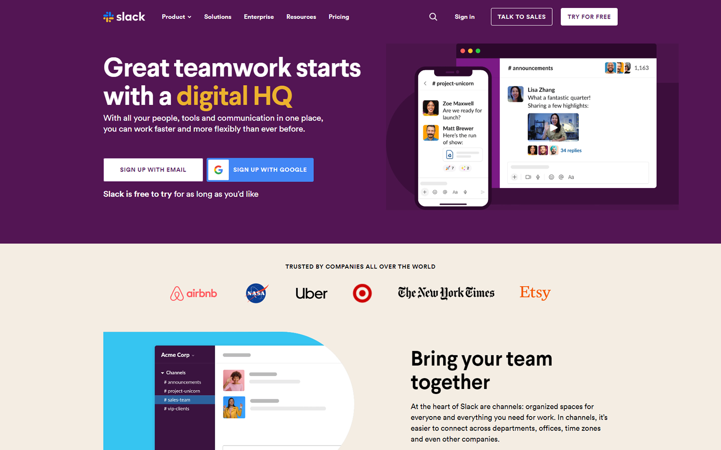
37. Slack
Why it works: This B2B website features animated graphics, big headings and cohesive use of colors. The different pages in this site are beautifully crafted. In-depth customers’ stories are highlighted on the home page with a corresponding unique page.
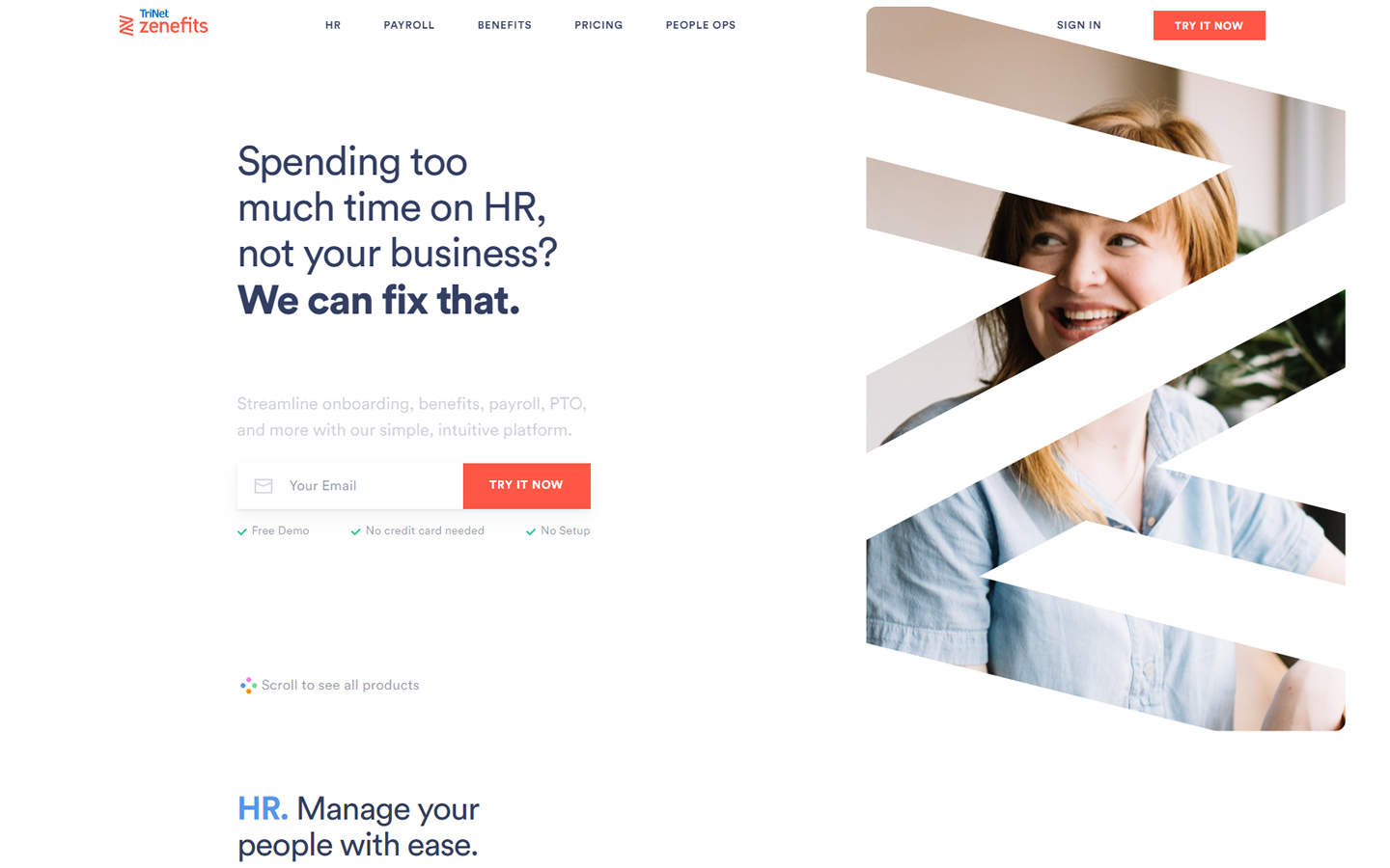
38. Zenefits
Why it works: The homepage includes a hero image that will transition in the sections’ animations to explain their product. The use of animation encourages the visitors to scroll through. Inner pages are also unique and highly functional.
Best B2B Website Design
39. Iconosquare
Why it works: A great example of a B2B web design using a specific and strong value proposition on the hero section. A homepage with free-flowing content, characterized by shapes between sections. The pricing plan page is always accessible thanks to the sticky navigation.
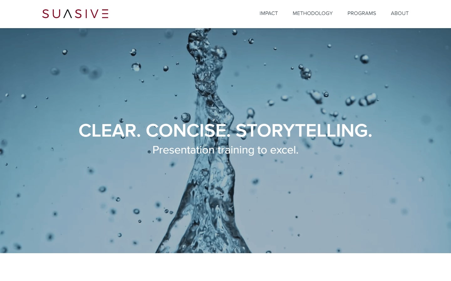
40. Suasive
Why it works: The website maintains a clean and minimalist design. Simple and always visible headings make it user-friendly. The consistent use of color with mouse hover effects is also helpful, as are the clean and complete footer sections.
Conclusion
If you have a B2B business, it’s important to remember that your website should primarily act as one of your most useful tools for content marketing. You’ll be able to generate leads, reach your target audience, and compete with other businesses. With high performance and current best SEO practices (search engine optimization), your new website can be the key to success for all your business goals.
If you would like to improve your current B2B websites or if you’re building your website from scratch we will design a custom mockup of your new website before you sign or pay for anything. There is nothing to sign and no payment information will be taken. If you like our B2B web design for your company we can move forward to the point of working together. If not, there are no hard feelings and no other obligations. Click the button below to learn more.
